Shape, form and suggestion
The power of allusion in brand identity
The hidden arrow in the FedEx logo. The smiling A to Z in Amazon’s mark. Much has been written in design circles about these visual puns, tricks of the eye – illusions – that create a Smile in the Mind of the viewer. They’re clever and fun, and when we spot them, we feel in on the joke. They drive word-of-mouth, build momentum, and add a touch of wit and personality to a brand’s identity.
But this post considers a quieter kind of expression: visual nods rather than visual puns. It’s called allusion – an indirect or subtle reference to something else: an idea, form, concept or symbol. In visual branding, an allusive shape might suggest nature, strength, movement, or a particular cultural reference, without being literal or fully figurative. It allows space for interpretation.
Why we use allusion in visual identity
There’s often a temptation – for both clients and designers – to say it all, to describe the thing in full, to leave no room for ambiguity. But in branding, allowing space for interpretation can be much more powerful than spelling everything out.
- Interpretation creates investment
Allusive design invites your audience to complete the thought. The act of participation and discovery makes meaning feel personal, creating deeper investment. - Restraint as a form of respect
It also demonstrates respect for your audience’s intelligence. It welcomes them as insiders, inviting them to discover rather than simply receive. - Symbolism travels further than specificity
A simplified flame shape might stand for energy, warmth and protest. A seed shape could speak to growth, change and potential. Allusive forms provide space for meaning to stretch, rather than limiting it. - Purity of form
A distilled shape – a circle, a square, an arrow – holds meaning without clutter. It’s adaptable, timeless, and communicates multitudes with elegance. - Less noise, more signal
There’s value in not overwhelming your audience with messaging, and this is particularly true in the third sector where topics can be complex or emotionally charged. Allusion offers a clear shape that can be inhabited, with room to grow, rather than an exhaustive narrative.
Case study – Windfall Trust
When it came to developing the brand identity for Windfall Trust, we deliberately avoided literal visual storytelling. The name itself carries a double meaning, the topic is complex and nuanced. The visual identity needed to be clean and clear yet rich with meaning.
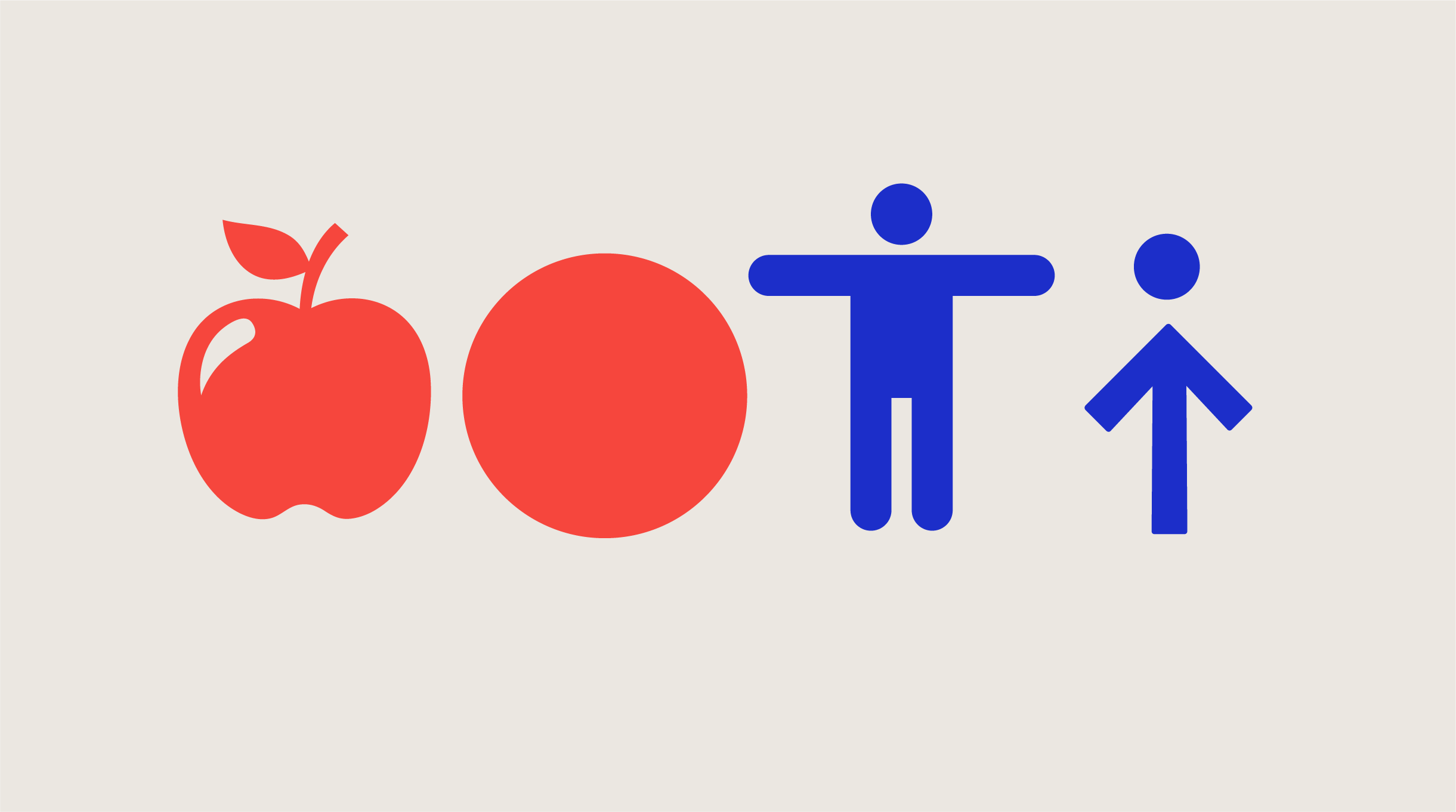
Rather than depicting apples, trees or falling objects, we created a system of abstracted shapes: a circle, a square and an arrow.
Each shape plays a part in the brand’s visual language:
- The circle might evoke a falling apple, or a consequence set in motion.
- The square brings solidity and creates a grid – a visual nod to structure, equity and social safety nets.
- The arrow carries direction, momentum and change, sometimes paired with the circle to suggest the human form – abstracted but never illustrative.
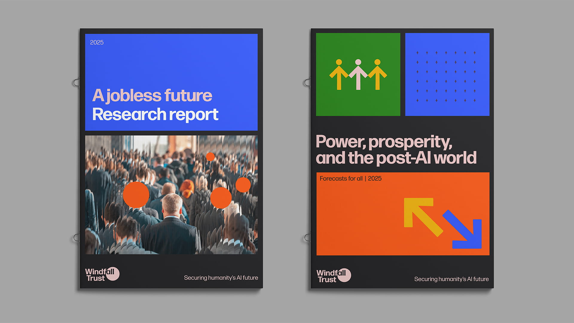
Examples of the circle, people and arrow shapes used in Windfall’s report cover designs:
The language of movement
The introduction of motion adds a further layer to this kind of visual language. Just as a static form can allude to meaning, so too can the way it moves.
For Windfall Trust, we developed a set of motion principles that extend the identity without overwhelming it. There is no bounce or swagger here – just considered, minimal motion that reinforces tone.
A circle that falls slowly hints at a windfall – not in a literal or cartoonish way, but through weight, rhythm and timing. An arrow might move with restraint to guide the eye. These gestures support meaning without grabbing for attention.
Motion principles: Windfall Trust
Windfall Trust motion style is considered, formal and minimal – always in service of the message, never decorative.
- 2D only – No 3D effects or perspective
- Subtle easing – No bounce or spring
- Falling circles – Referencing falling apples
- Abstract figures – Circle + arrow may suggest a person, but must remain abstract
Motion should reinforce clarity, rhythm and tone – not compete for attention.
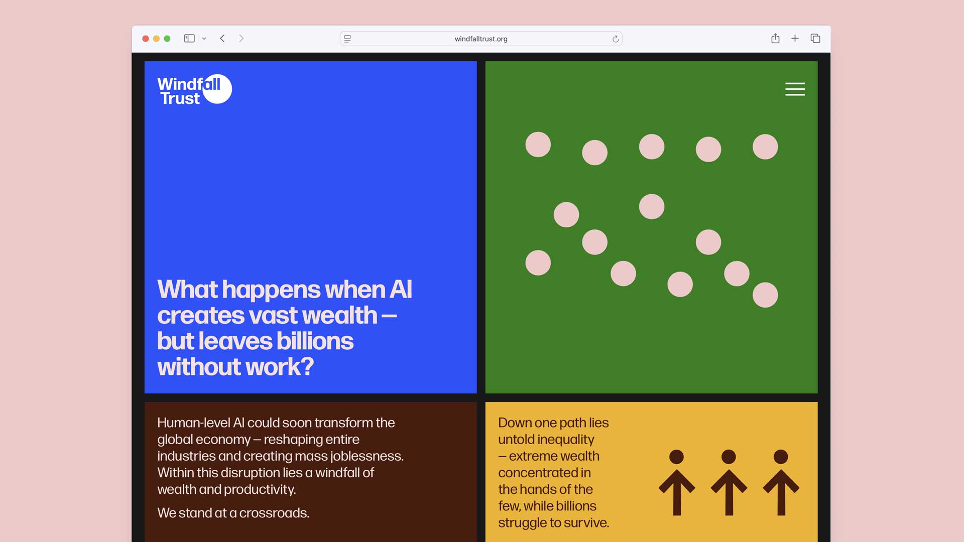
An example of Windfall’s motion principles used in a presentation deck:
The full picture
Visuals alone rarely do the full job of communicating meaning. In the case of Windfall Trust, much of the heavy lifting is done by the brand’s messaging and narrative structure – from the idea that there will be a windfall of wealth concentrated in very few hands, to the urgent choices we face about how that wealth will be distributed.
The visual identity provides an anchor – a shorthand – but it only resonates fully when paired with the right words. In branding, allusive design isn’t vague – it’s strategic. The image and language work in tandem, rather than in isolation.
It’s also worth recognising that not everyone will interpret the layers in the same way – and that’s okay. Some people will connect with the deeper meanings embedded in the identity; others may simply enjoy the brand’s clean aesthetic. A visual language built on allusion doesn’t insist on being decoded – it offers depth for those who seek it, and simplicity for those who don’t.
The power of restraint
There’s often pressure in branding – especially in the charity and third sectors – to explain, to show, to provide absolute clarity beyond doubt. But being clear doesn’t have to mean being literal. Sometimes, the most powerful identities are those that trust the audience, and allow space for interpretation.