St John’s Foundation has been part of Bath’s social fabric for more than eight centuries, providing housing and support for older people while continuing to evolve its role within the community. The Co-Foundry was invited to refresh the charity’s brand identity and support the development of a new website – helping St John’s express its purpose, personality and work with greater clarity, relevance and warmth.
Challenge
With its long and storied history, the challenge was not reinvention but renewal. The existing brand had valuable equity, particularly in the distinctive sunburst motif within the logo. However, the wider identity had become limiting in application and no longer fully reflected the charity’s warm, optimistic and community-focused spirit.
We felt stuck in the past. Our brand didn’t reflect who we were or who we wanted to become. There’d been so much change at St John’s, but the brand felt old-fashioned and difficult to use – it just didn’t represent the organisation we’d become.
– Clare MacLeod, Head of Marketing & Communications, St John’s Foundation
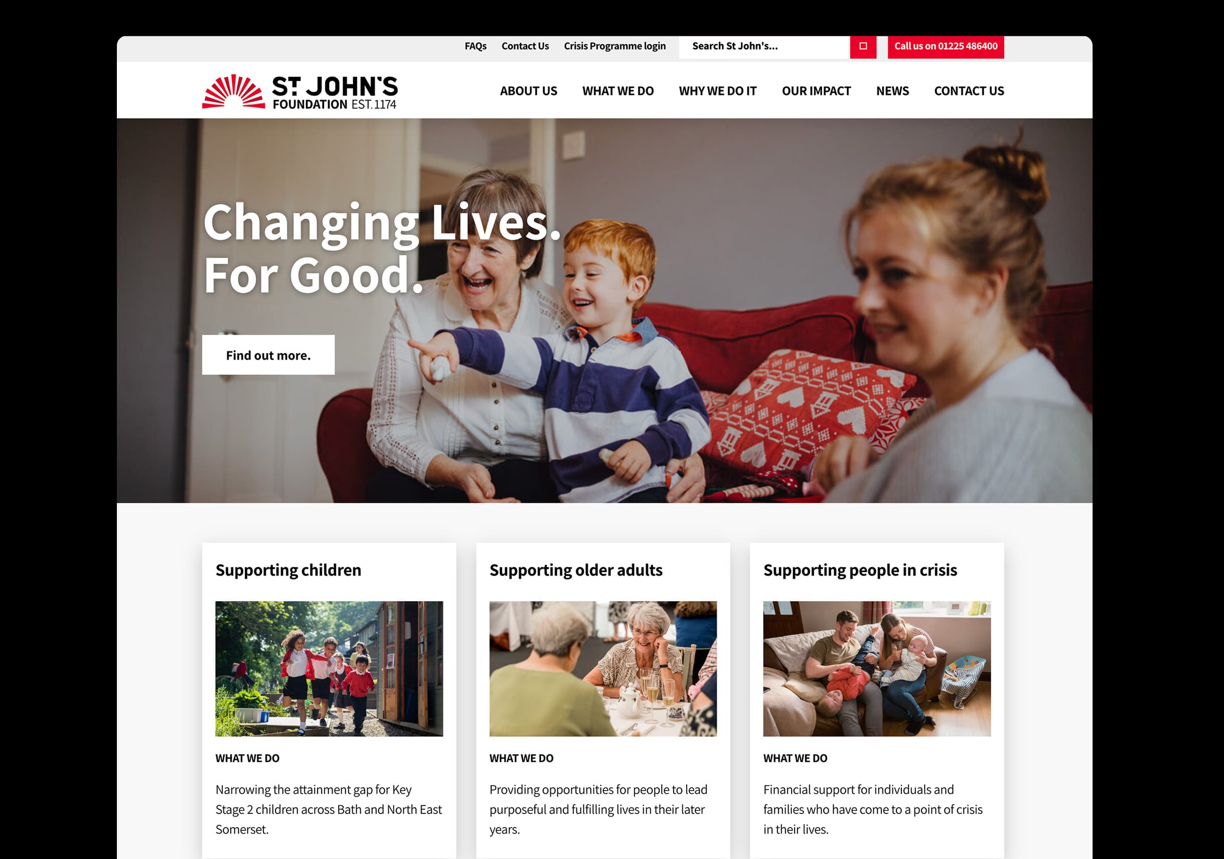
The visual language leaned on black and red – colours that felt austere and echoed a wider trope in the older living sector. While the photography, tending towards posed and serious imagery, missed the everyday moments of connection and vitality that define life at St John’s.
This presented an opportunity to evolve the identity – building on what people already recognised while creating a more joyful and flexible expression of the organisation’s purpose.
Approach
Following audience research carried out by The Difference Engine, we conducted a brand audit and peer review to understand how St John’s currently appeared across communications and how it sat within the wider sector.
These findings informed a team co-creation workshop exploring St John’s aspirations, personality and positioning, alongside potential visual directions including typography, colour, photography and graphic language. This insight provided firm foundations for the work.
Through this process we clarified a set of core qualities that felt authentic to the organisation: committed, warm-hearted, joyful and enduring. Together these attributes capture the balance at the heart of St John’s – an organisation deeply rooted in Bath’s history, yet continually looking for new ways to support people and community life.
We wanted to involve residents, staff and trustees from the outset. Your process meant we could do that properly, building real buy-in. That’s led to a ripple effect across the organisation, with people going back to their teams and actively championing the new brand.
– Clare MacLeod, Head of Marketing & Communications, St John’s Foundation
Solution
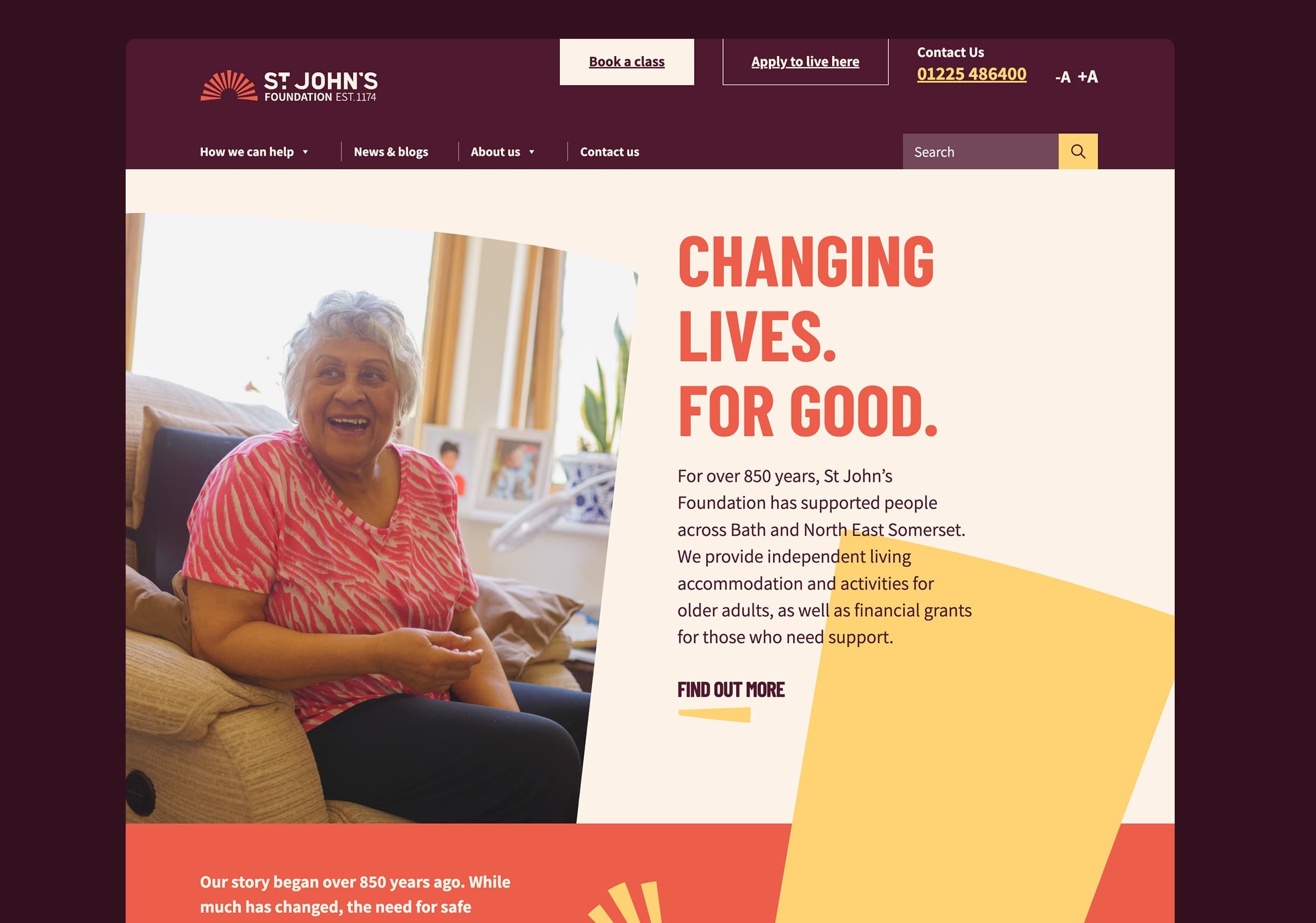
The refreshed identity builds on St John’s strongest existing asset – the rays of light within the logo’s sunburst. Rather than replacing this recognisable feature, we developed it into a flexible graphic language that extends across the brand.
The rays now appear as accents, shapes and bold crops across communications, bringing movement and dynamism to layouts while remaining clearly connected to the original mark. Used alongside candid imagery and confident typography, they create a visual system that feels lively, distinctive and practical across print and digital formats.
We also introduced a brighter and more expressive colour palette, introducing warmth and optimism to the brand, complementing it with informal photography which captured candid moments of everyday connection – conversations, shared activities and small gestures of support. The palette and images help communicate a central idea within the brand: that through St John’s, people find connection, friendship and a brighter way of living.
As part of the refresh we also reviewed the organisation’s brand architecture. The charity had developed a separate Good Living brand for some of its activities. Given the scale of the organisation and its marketing resources, our recommendation was to simplify communications under the single St John’s Foundation brand, in order to strengthen recognition and consistency over time.
Previous brand architecture
To support this, we also developed comprehensive brand guidelines to support consistent application of the refreshed identity across the organisation. Alongside guidance on typography, colour, imagery and the use of the sunburst graphic language, the guidelines include accessibility recommendations to help ensure communications remain inclusive and readable for a wide range of audiences.
As well as the identity work we supported the development of a new website. As part of this process we carried out UX research with St John’s almshouse residents – visiting the homes and speaking directly with residents to understand how they access and experience websites. These conversations provided valuable insight into accessibility, navigation and reading preferences, helping shape a digital experience that is clear, welcoming and easy to use. The website was built by Bristol-based Jambi Digital.
The refreshed visual language translates naturally into the digital environment, where the sunburst forms, brighter palette and candid imagery contribute to creating a warm and engaging experience. The new site provides clearer pathways for residents, community members and partners, allowing St John’s to tell its story and communicate its work more effectively.
It’s fab, I love it
– Resident feedback
In a world where ageism so often takes the form of negative stereotypes, St John’s refreshed brand honours its heritage while presenting a brighter, more human and contemporary face to the community it serves.
This brand refresh marks a progressive and permanent move forward. You guys really got under the skin of the organisation. It’s all been done so thoroughly, with such a clear process, that we feel really confident in the brand as we launch it.
– Clare MacLeod, Head of Marketing & Communications, St John’s Foundation