
Resist the silver bullet
I’ve noticed a growing nervousness around going for a full rebrand at the moment. And honestly, that feels entirely rational.
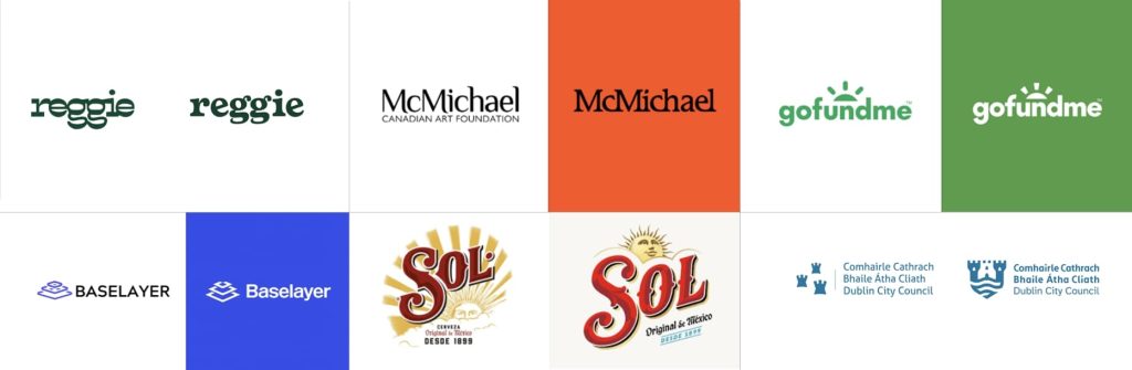
In Brand New – the weekly design industry review published by UnderConsideration – there has been a clear pattern recently: a move towards favouring refinements over wholesale reinventions. Logo adjustments. Careful identity updates. A sense of organisations protecting and developing what they’ve already built.
In an uncertain economic climate, that instinct makes sense. Hard-won brand recognition, awareness and trust are not to be gambled with.
But watching this pattern emerge raises a more fundamental question. When organisations reach for any sort of change, what is it that they’re really trying to solve?
Brand refinements are a bit like ducks on water. On the surface, everything looks calm – sometimes deceptively so. But beneath that calm, there should be purposeful paddling. Research, evidence, testing and judgement about what to hold onto and what to move on from should make up the very intentional forward momentum.

And there should also be acknowledgement that occasionally, that paddling reveals something uncomfortable. That the issue may not lie with brand at all.
The silver bullet instinct
In our recent Behind the Brand research, one key theme emerged: frustration with the idea that a rebrand is an easy-fix remedy.
There’s a belief that you just do a rebrand and the problem gets solved. People keep throwing it at the issue because they think, ‘That’ll fix it.’
— Director of Brand and Communications, racial justice charity
This didn’t mean that there was a resistance to change. It spoke of a resistance to rebrand being the default position.
From an organisational perspective, the more productive starting point is often diagnostic rather than creative. Why isn’t the existing brand working? Is it coming across with sufficient clarity, consistency and internal belief?
“You’ve launched it – now be consistent. If your team is fed up seeing the same image every day, then tough, because millions haven’t seen it.”
“In the early stages, be consistent. Live it. Give it time.”
There’s something in that honesty that’s worth a pause. Internal fatigue is not the same as external saturation. Teams see the brand every day; audiences don’t.
I’ve written before about the danger of discarding hard-earned brand equity simply because it feels over-familiar internally – of mistaking boredom for obsolescence. In many cases, what needs attention is not the core idea, but the discipline and consistency behind it.
In the third sector especially, where resource is finite and scrutiny high, a rebrand can feel like visible action. It signals movement, reassuring stakeholders that something is being done. But it isn’t the only way to mark a turning point or open a new chapter.
Change, fear and judgement
None of this is an argument against significant change. Sometimes culture shifts, strategy is redefined and the gap between who you are and how you show up becomes too wide to ignore.
The difficulty lies in recognising when significant change is unavoidable and when restraint, however uncomfortable, is the wiser move.
Well-judged refinement can be transformative, particularly when it sharpens clarity and strengthens distinctive assets. Equally, caution driven by fear can leave organisations stuck in cosmetic adjustment, never quite addressing the real issue.
The point is not whether to change, but whether the choice to do so is born of strong intentions.
Don’t reinvent the wheel. See what’s working, see what’s not working.
The advice may sound straightforward, but in practice, it requires evidence, candour and a willingness to look beneath the surface.

Brand as stewardship
The findings also drew attention to a particular aspect of governance.
All too often, brand only ever reaches boards at moments of visible change – a service launch, a re-positioning, a crisis. Yet brand strength is something that is shaped in all the in-between times, through consistent application and investment in capability.
If brand is treated as a periodic event, it will always feel unstable.
If it’s treated as stewardship, the need for wholesale intervention becomes rarer.
That stewardship includes:
- Supporting continuity, not just headline moments
- Planning for what happens after launch
- Building capability and systems for the longer term
- Choosing conviction over playing-it-safe dilution
Stewardship involves adopting a long-term perspective and a disciplined approach.
A shift in emphasis
We’re currently working on refreshing the identity of a long-established organisation with deep roots and a strong visual motif. There was never any appetite to discard what already carries so much recognition and trust.
Instead, the work has been about recalibration. Holding onto the code that signals continuity, while dialling up the emotional register of joy. Allowing the identity to move from heritage as something preserved, to heritage as something lived.
Not because change is fashionable. But because the strategy demands it.
That kind of shift is not dramatic from a distance. Like the duck, much of the effort happens beneath the surface. But when it is grounded in evidence and conviction, it transforms and strengthens the brand proposition.
Before you rebrand
If you’re contemplating a significant change to your brand, there are a number of questions drawn from our research project that are well worth considering. Answering these will help steer you in the right direction – be that recalibration and refinement or a wholesale rebrand:
- What exactly isn’t working?
- Is the issue visibility, clarity, capability or consistency?
- Have we truly embedded what we already have?
- Are we responding to evidence or to discomfort?
Sometimes the most strategic move isn’t a reinvention. But disciplined focus, sustained over time. Stewardship not showmanship.

You can read the full report here – readable online or downloadable for later.
Behind the Brand 2026
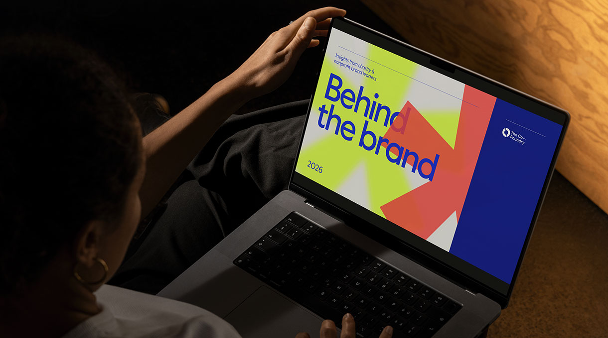
Behind the Brand 2026 shines a timely light on the realities of brand leadership across the third sector today. Drawing on a sector-wide survey and in-depth interviews, the report explores the challenges brand leaders face, the factors that help them succeed, and the role organisations can play in enabling more effective, joined-up brand thinking.
For the best viewing experience, use the full-screen option. If you’re viewing on mobile or prefer to read offline, you can download the PDF here (3.4MB).
Five key themes
Insights are grouped around five key themes that emerged from the survey responses and interviews. Some of these are familiar – others, unexpected – but all reflect the pressures brand leaders in this sector continue to face as well as the progress being made:
Insight themes:
- Brand leaders are influential… but influence is fragile
- Capacity, budget and “random acts of branding” are the universal barriers
- Rebrands are common… and often driven by the same three things
- Organisations value evidence in theory… but not always in practice
- Brand leadership is becoming more complex – emotionally as well as structurally
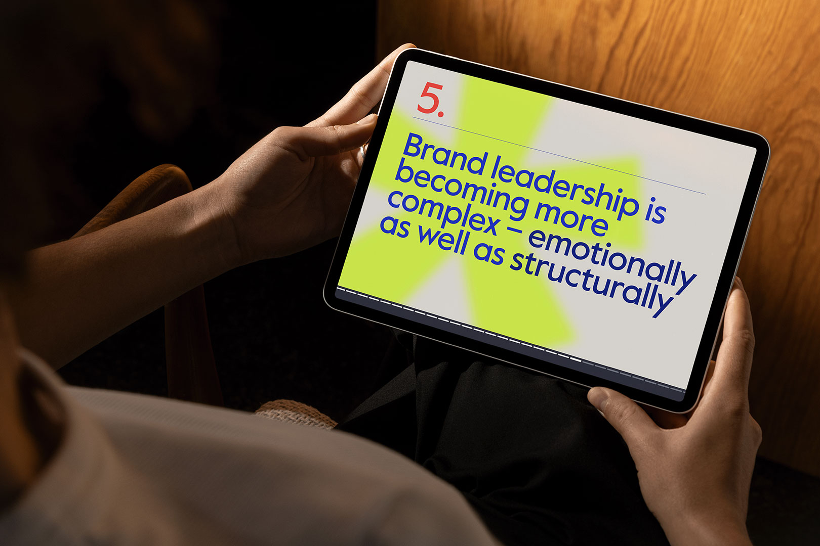
Download a PDF version of the report here.
What shines through is that in complex and uncertain times such as these, developing and maintaining a strong brand has never been more important. It plays a vital role in helping the sector connect with its many audiences – from beneficiaries and supporters, to funders, policymakers and partners.
Brand may be underfunded and vulnerable during periods of economic pressure. Brand leaders may still be under-represented at board level. But at the same time, more organisations are recognising how central brand is to their success.
A clear path forward
With something for everyone involved in this sector – the report concludes with valuable recommendations for trustees, senior leadership teams, agencies and external partners, and for the very brand, marketing and communications teams that responded to our research.
These are tangible ways that will see brand leadership – for too long, unseen and unsung – brought out from behind the brand and better equipped to help build the thriving, resilient organisations that drive lasting change.
Interested in discussing the findings?
If any of the themes in Behind the Brand 2026 resonate with your experience – or raise questions about how brand leadership shows up in your organisation – I’d love to hear from you. Whether you’re a trustee, senior leader or part of a brand, marketing or communications team, this research is intended to spark better conversations.

‘Then’, ‘now’ and ‘what next?’
A question I often get asked in brand workshops is, “Is this exercise aspirational or about where we are now?”
It isn’t an easy one to answer. On the one hand, we need to uncover what’s happening right now, on the other, we need to understand what has to change to help us reach our longer-term, strategic goals.
The aim is always making sure your brand is fit for a changing landscape – rooted in its founding principles, yet visionary in its direction.
A brand strategy, at its simplest, is about answering questions and making intentional choices for the future. But those answers don’t appear in isolation. They draw from your past, reflect your present reality, and point towards the legacy you want to create.
When I work with organisations to define or refine their brand strategy, I use five core questions. Each question can be viewed through the lens of ‘then’, ‘now’ and ‘what next’. Together, they help uncover what to carry forward, what to change and what to build towards.
Before we look through the lenses, it helps to be clear about the five core questions themselves – the foundations every brand strategy should be interrogating.
The five questions framework
- What problems do we solve?
Our mission – what we do and who we serve.
Our value proposition – how we solve problems and create value.
Our vision – the future we’re helping to build; what success looks like when our work is done. - Why do we exist?
Our purpose – the enduring contribution we make to the lives of others.
Our impact and legacy – the difference we create through our work and the change we hope will outlast us. - What do we value?
Our beliefs and values – the principles that guide how we act and the convictions that define what we stand for and against. - Where do we play and what do we want to be known for?
Our positioning – the space we occupy in people’s minds and how we differentiate ourselves.
Our audiences and peers – the context in which we operate; who we influence and who we stand alongside. - How do we look, feel and sound?
Our expression – how our character comes to life through visuals, words and behaviour.
Now let’s see how each question can be explored through time – through the lenses of then, now and what next.
The three lenses:

Stories may begin in the past but brand strategy invariably takes the here and now as its starting point: From the reality of how things are working today, to the tensions that may signal the need for a new direction.
The interaction of past, present and future in the life of a brand is fluid.
The Present: truth and alignment
An organisation is often moved to review its brand because things may not be working as they should or once did, or because a new development or chapter is on the horizon. You start in the present: what’s true now, what audiences think and feel, and what the data and context tells you. The best way to uncover these truths is through research and discovery – by running interviews with an organisation’s key leaders, partners and stakeholders, surveying staff and audiences, running interactive workshops and reviewing the context in which the brand operates.
Brand perception research plays a vital role – offering a clear-eyed view of how you’re seen today and the foundations you’ll be building on for the future.
But perhaps even more importantly, once you understand the truth of where you stand in the present, you can reflect on how that relates to what you have always stood for. Ask yourself: What early ideas still hold? Going back to your roots can recalibrate what really matters.
The Past: purpose, roots and lessons
Every organisation has a past and that past is full of clues. Reminding yourself of your origin story and milestones – who you are, why you set out to make a change in the first place, and how far you’ve already come – feels tangible.
For some organisations, especially those with a long history, there’s a creative treasure trove to draw on for brand expression: language, imagery, archives, even physical artefacts. In positioning terms, heritage can be something truly ownable – no one else can claim it. As Mark Ritson puts it:
Whether you’re 20 years old or 200 years old, you’re going to dig through your history to try and identify anything that might possibly be a code of your brand.
Looking back can help you see how your founder’s principles have lived on through your mission, purpose and values. Often, these founding ideals contain golden insights that have been lost or diluted over time. Reconnecting with them can be a powerful moment of rediscovery.
Case in point – WithYou
One example that illustrates the power of reconnecting with origin and purpose is a recent Co-Foundry client, WithYou. WithYou is a national charity that supports people experiencing drug, alcohol and mental health challenges. Their origins are rooted in the lived experience of their founder – their mission is driven by compassion – an ethos of standing alongside those they work with.
The charity’s founder, Mollie Craven, lost her son to heroin in 1967. In an article in The Guardian that year, she urged parents and friends of those struggling to come together, share research and develop understanding. That spirit of togetherness continues to shape the organisation’s values today.
Read the full case study →
Research and discovery needs to take in all your audiences. Staff and volunteers are as much a part of your brand community as external audiences. A shared sense of heritage can build belonging and pride internally, strengthening the emotional glue that holds an organisation together.
Looking to the past also helps to re-evaluate what might need to change. Many organisations continue to reflect the values of their founders – sometimes consciously, sometimes not. Revisiting those values in the light of today’s culture is essential. What was once progressive might now feel dated. Equally, some previously overlooked ideas may feel powerfully relevant again.
That said, bear in mind that history should inform, not define. The past provides the roots but the present and future are where growth happens, with new people coming on board, new challenges emerging and services evolving.
It’s also important to recognise that not all history is positive. Your consultant or agency needs to understand any negative perceptions or difficult chapters. Acknowledging them lowers the risk of accidentally resurrecting old grievances – and opens the door to telling a more honest, balanced story.
Getting the balance right – John Lewis
The John Lewis Heritage Centre offers a masterclass in celebrating legacy while looking forward. It tells the story of the brand’s role in community life as well as retail life – reminding customers and employees alike why the brand still matters today.
Finding ways to celebrate your own past – through anniversary projects, storytelling or visual references – can strengthen the thread between then, now and what’s next.
Once you’ve reconnected with the truths and lessons of the past, you can turn your attention to what comes next.
Every organisation sits in motion – shaped by its history but propelled by the forces of change. Having understood what to carry forward, the next task is to look ahead – to anticipate the world you’re moving into, the pressures you may face, and the legacy you want to leave behind.
The future: direction, ambition and legacy
Now for what is arguably the most difficult part: preparing for what’s next.
A brand strategy is, at its core, a plan for the future. But in today’s landscape, planning isn’t enough. You need to think like a futurist – setting aside trend-chasing in favour of identifying the patterns and pressures that could shape your work in years to come. That means holding two ideas at once: planning to achieve the aspirations you already have and anticipating the new challenges or opportunities that might emerge.
Aspirations and guardrails
In addition to defining what you want to be, it’s often helpful to define what you don’t want to become. What compromises would see you diluting your purpose? What distractions could pull you away from your mission or values?
Equally, organisations must stay alert to wider forces – economic, environmental and technological. Future-facing strategy isn’t just aspirational, it’s also a form of risk management. By imagining possible scenarios now, you’re better prepared to adapt later.
The empty chair
For some clients, depending on their challenge, I encourage the “empty chair” technique. Picture an unoccupied seat at your board table or workshop – it represents future generations. What might they say about the decisions you’re making today? Would they see courage or complacency? Would they thank you for taking action on climate, for using technology responsibly, for creating opportunities rather than narrowing them?
Inviting that voice into the room helps reframe short-term discussions into longer-term accountability. It expands the remit of brand strategy from planning tool to ethical framework.
When purpose evolves
In times of stability, an organisation’s purpose is its compass. But when the world shifts, that compass may need recalibrating. Radical innovation, climate change, or socio-economic upheaval can all prompt deeper questions:
- Does your operating model still serve our mission?
- Is your purpose still bold enough, relevant enough, inclusive enough?
- Do your audiences or focus areas need to evolve to meet emerging needs?
We’re currently working with a client who recognised a growing need to support vulnerable older people. Their original remit focused on a range of ages and needs: older people, families and young people, but demographic changes and new evidence of unmet need prompted a shift in strategy. They’re not abandoning their founding purpose – they’re realigning it to have greater impact where it’s most needed.
Envisioning the future together
In our workshops, we use a visual exercise to explore this territory: Our Brand Perception Canvas™ is made up of three spaces, labelled Past, Present and Future. Before the session, the Present space is pre-populated with post-it notes drawn from brand perception surveys completed by internal and external audiences. Together, we then map what we know of the Past – both the things we’ve forgotten and the things we’d prefer others forget. Finally, we move ideas, truths and aspirations into the Future space: what we want to carry forward, strengthen or transform.
It’s a visual, participatory way to bridge history, reality and possibility and to make sure your brand strategy doesn’t just describe the future, but actively shapes it.

Finding the answers
Having explored each lens, the next step is synthesis – bringing everything into one view. Pausing to review, reflect and envision offers a wealth of insight. Clarity on what to hold on to, what to let go of and what to grow into emerges from that pause.
In the words of one of our clients:
After 23 years of challenges and successes, it felt like the perfect time to pause and reflect and think about how we tell our story for the future. The process helped us recognise our strengths and share those more strongly with our guests. That might sound simple, but it’s incredibly powerful.
Alison Howell, Co-Founder, Foot Trails, travel brand
On reflection
A good brand strategy doesn’t replace what came before; it builds on it. It recognises what’s still valuable, confronts what no longer serves and charts a course that’s both honest and ambitious.
Free guide for social impact charities and nonprofits

Every journey begins with a single step
But it needs to be a step in the right direction. And if you’re looking to rebrand, that’s where our guide comes in.
‘Where to start with your rebrand project’ has been written specifically for third sector organisations that recognise brand as a driver of greater impact. It’s a five-step framework that will help you lay the foundations for a confident brand, one that has the buy-in of teams and stakeholders baked in from the start.
No big creative promises or sitting through glossy presentations, our guide is focused on what matters to you most – your purpose and the people you serve.
Creative and energising, it’ll lead you to a brand identity that will last. One that will fit, resonate and perform. One that can evolve with your organisation and that you won’t feel the urge to change in a year’s time.
It’s a printed guide, made to be held and designed to look great on your desk where it will be referred to over and over again. Definitely not one to languish half-forgotten in a downloads folder.

So, take the next step…
Request your copy
Fill in the form and let’s arrange a quick, no obligation chat to make sure the guide is right for where you are in your brand journey.
Shape, form and suggestion
The hidden arrow in the FedEx logo. The smiling A to Z in Amazon’s mark. Much has been written in design circles about these visual puns, tricks of the eye – illusions – that create a Smile in the Mind of the viewer. They’re clever and fun, and when we spot them, we feel in on the joke. They drive word-of-mouth, build momentum, and add a touch of wit and personality to a brand’s identity.
But this post considers a quieter kind of expression: visual nods rather than visual puns. It’s called allusion – an indirect or subtle reference to something else: an idea, form, concept or symbol. In visual branding, an allusive shape might suggest nature, strength, movement, or a particular cultural reference, without being literal or fully figurative. It allows space for interpretation.
Why we use allusion in visual identity
There’s often a temptation – for both clients and designers – to say it all, to describe the thing in full, to leave no room for ambiguity. But in branding, allowing space for interpretation can be much more powerful than spelling everything out.
- Interpretation creates investment
Allusive design invites your audience to complete the thought. The act of participation and discovery makes meaning feel personal, creating deeper investment. - Restraint as a form of respect
It also demonstrates respect for your audience’s intelligence. It welcomes them as insiders, inviting them to discover rather than simply receive. - Symbolism travels further than specificity
A simplified flame shape might stand for energy, warmth and protest. A seed shape could speak to growth, change and potential. Allusive forms provide space for meaning to stretch, rather than limiting it. - Purity of form
A distilled shape – a circle, a square, an arrow – holds meaning without clutter. It’s adaptable, timeless, and communicates multitudes with elegance. - Less noise, more signal
There’s value in not overwhelming your audience with messaging, and this is particularly true in the third sector where topics can be complex or emotionally charged. Allusion offers a clear shape that can be inhabited, with room to grow, rather than an exhaustive narrative.
Case study – Windfall Trust
When it came to developing the brand identity for Windfall Trust, we deliberately avoided literal visual storytelling. The name itself carries a double meaning, the topic is complex and nuanced. The visual identity needed to be clean and clear yet rich with meaning.
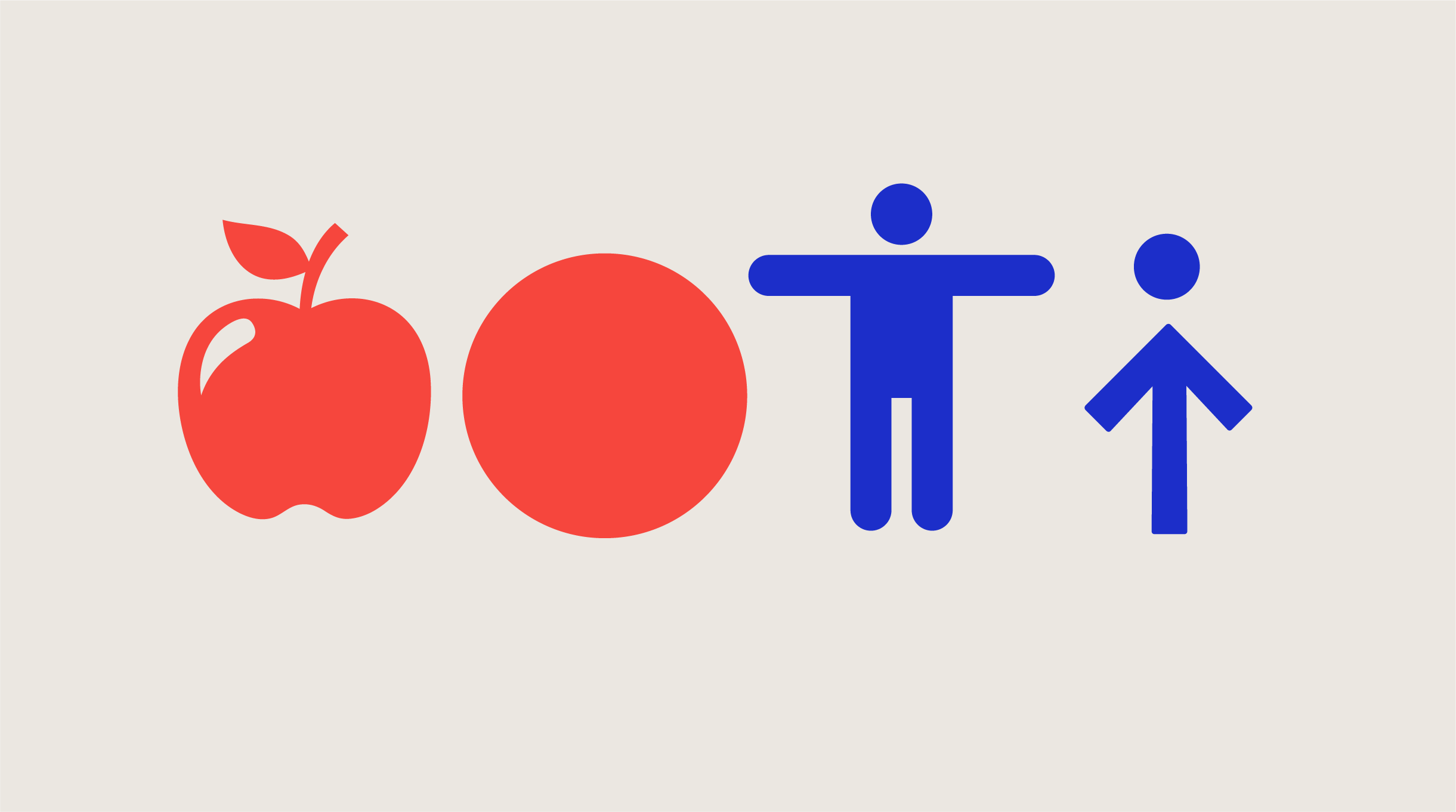
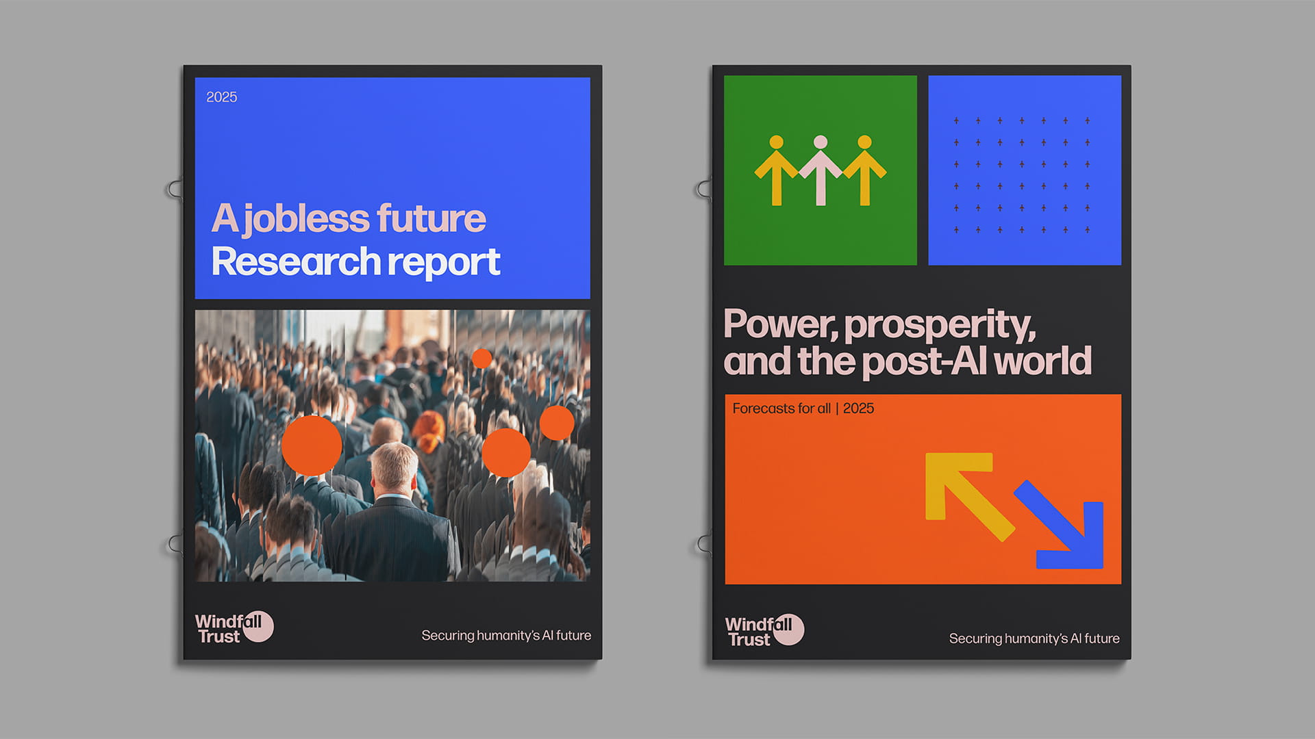
Rather than depicting apples, trees or falling objects, we created a system of abstracted shapes: a circle, a square and an arrow.
Each shape plays a part in the brand’s visual language:
- The circle might evoke a falling apple, or a consequence set in motion.
- The square brings solidity and creates a grid – a visual nod to structure, equity and social safety nets.
- The arrow carries direction, momentum and change, sometimes paired with the circle to suggest the human form – abstracted but never illustrative.
Examples of the circle, people and arrow shapes used in Windfall’s report cover designs:
The language of movement
The introduction of motion adds a further layer to this kind of visual language. Just as a static form can allude to meaning, so too can the way it moves.
For Windfall Trust, we developed a set of motion principles that extend the identity without overwhelming it. There is no bounce or swagger here – just considered, minimal motion that reinforces tone.
A circle that falls slowly hints at a windfall – not in a literal or cartoonish way, but through weight, rhythm and timing. An arrow might move with restraint to guide the eye. These gestures support meaning without grabbing for attention.
Motion principles: Windfall Trust
Windfall Trust motion style is considered, formal and minimal – always in service of the message, never decorative.
- 2D only – No 3D effects or perspective
- Subtle easing – No bounce or spring
- Falling circles – Referencing falling apples
- Abstract figures – Circle + arrow may suggest a person, but must remain abstract
Motion should reinforce clarity, rhythm and tone – not compete for attention.
An example of Windfall’s motion principles used in a presentation deck:
The full picture
Visuals alone rarely do the full job of communicating meaning. In the case of Windfall Trust, much of the heavy lifting is done by the brand’s messaging and narrative structure – from the idea that there will be a windfall of wealth concentrated in very few hands, to the urgent choices we face about how that wealth will be distributed.
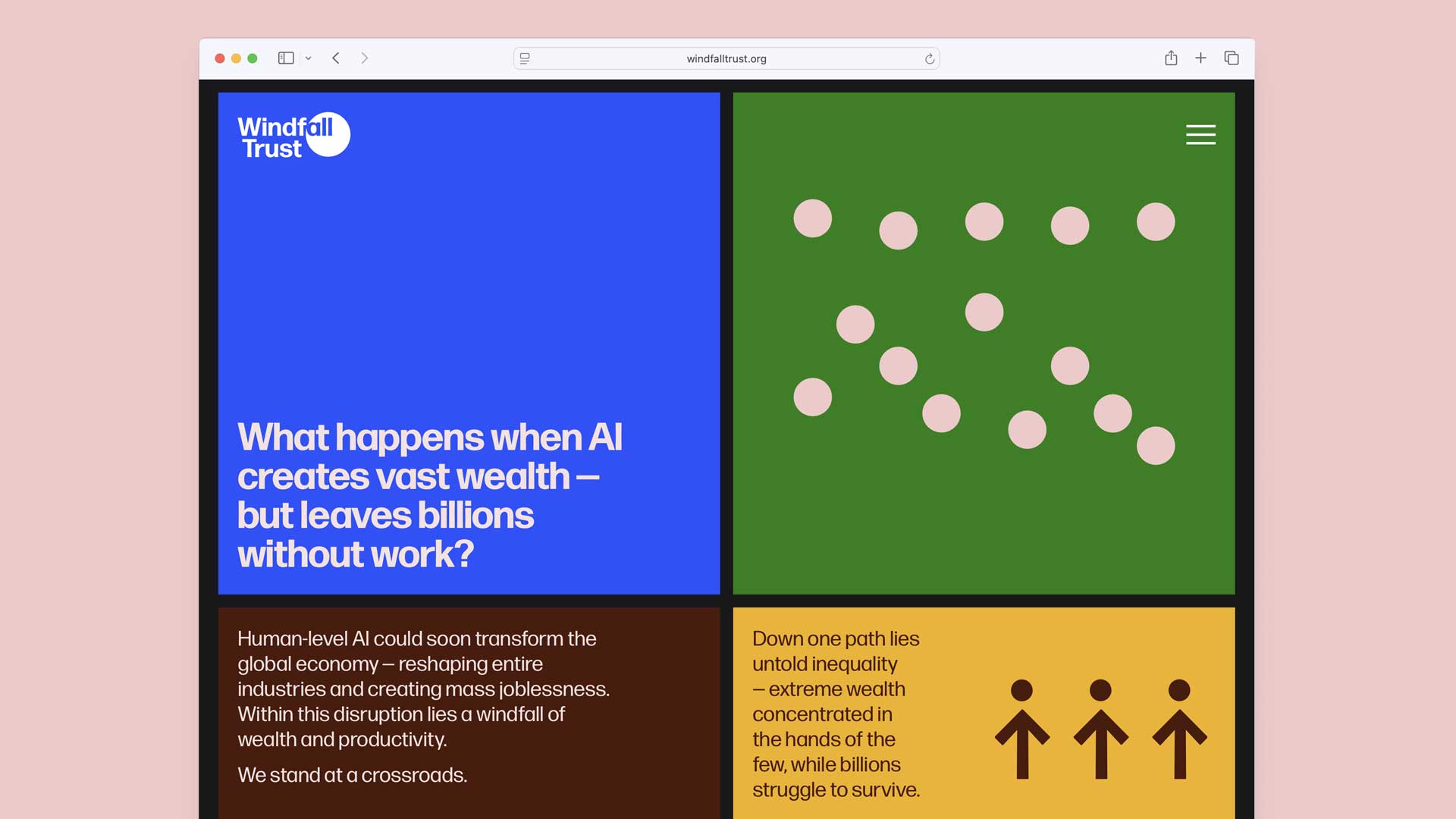
The visual identity provides an anchor – a shorthand – but it only resonates fully when paired with the right words. In branding, allusive design isn’t vague – it’s strategic. The image and language work in tandem, rather than in isolation.
It’s also worth recognising that not everyone will interpret the layers in the same way – and that’s okay. Some people will connect with the deeper meanings embedded in the identity; others may simply enjoy the brand’s clean aesthetic. A visual language built on allusion doesn’t insist on being decoded – it offers depth for those who seek it, and simplicity for those who don’t.
The power of restraint
There’s often pressure in branding – especially in the charity and third sectors – to explain, to show, to provide absolute clarity beyond doubt. But being clear doesn’t have to mean being literal. Sometimes, the most powerful identities are those that trust the audience, and allow space for interpretation.
How brand can help build a movement
There are any number of crises facing the world in 2025. A planet-threatening climate emergency and the upheaval and disruption of the coming age of AI are just two of the big challenges of the day. All of this is set against the backdrop of an increasingly divided world where the established world order is being carelessly and chaotically dismantled, creating further danger.
In times of fear and darkness, there are those who aren’t stopped in their tracks – they choose hope, step up and take action. They are the visionaries – those who can see a way of tackling challenges and building a better world for everyone. And they are needed now more than ever.
But visionaries can’t act alone. To effect real, meaningful and lasting change, they need to inspire others and build movements around their vision. Movements that channel a message of hope and motivate others to walk with them.
Martin Luther King Jr in his ‘I have a dream’ speech spoke of uniting behind hope:
With this faith, we will be able to hew out of the mountain of despair, a stone of hope. With this faith, we will be able to transform the jangling discords of our nation into a beautiful symphony of brotherhood. With this faith we will be able to work together, to pray together, to struggle together, to go to jail together, to stand up for freedom together, knowing that we will be free one day.
Hope grows when people are brought together by ideas with emotional heft. For these ideas to become movements that are capable of building momentum, they need to also be possessed of clarity of purpose, coherence and character. These are traits they share with strong brands.
How movements have deployed the power of brand
Brand may not be the hero, nor is the idea of brand a stated element of many movements, but ‘brand-thinking’ offers a useful perspective on successful movements (both past and present) that agitated for and achieved change.
In the following paragraphs I hope to show the role brand played, and continues to play, in getting people to join a cause, spread the message and create real and lasting change. Brand, in this instance is rarely slick or polished – it focuses on a strong sense of its values from which consistent, intentional choices around messaging, visual identity and action flow.
Having quoted MLK I’ll start by unpacking the ‘brand identity’ of the US Civil Rights Movement.
Civil Rights movement (US)
While it wasn’t branded in the modern sense, the Civil Rights movement had moral clarity, a cohesive visual language and leadership who understood the media. Rooted in dignity, symbolism and storytelling, its identity was brought to life through photography and collective action rather than logos or graphic design. Church settings, hymn singing and linked arms became visually associated with a movement that also saw sit-ins at lunch counters and marches.
The 1963 March on Washington saw long lines of people, many dressed in their Sunday best. Looking respectable was a strategic decision that contrasted the dignity of the protestors with the violence of the segregationists. The sheer numbers and solemnity of the day made for powerful and unforgettable images.
The signs these peaceful protesters carried, with their simple, printed messages – “I AM A MAN”, “We Demand Voting Rights Now” and “End Segregated Rules in Public Schools” became iconic. Visually uniform, they functioned as a form of mobile branding – speaking of the gravity of the situation and the timelessness of the cause.

The fight for racial equality in the US faced extraordinary resistance but the Civil Rights movement, grounded in a clear and powerful ethos of justice, galvanised public support and ultimately forced change – both in policy and in how society understood basic rights. What once seemed unattainable is now accepted. And although racial gaps continue to persist, the movement is a testament to the power of collective identity and message.
Women’s suffrage movement (UK)
Use of a strategic visual identity, clear messaging and direct action were aspects of the movements (suffragists and suffragettes) that sought to give women the right to vote from the early mid-19th century onwards.
The suffragists’ methods – lobbying and petitioning – were peaceful, while the suffragettes (founded in 1903) were more militant and radical in their tactics, generating greater and more widespread awareness. The latter’s colour-coded protests and co-ordinated marches, such as the Suffragette Procession of 1910 with its costumed historical figures, generated striking imagery and made their demands difficult to ignore.
The suffragettes adopted purple (dignity), white (purity) and green (hope) to emphasise their message. These were used in banners, sashes, badges, jewellery, and even fashion, creating a powerful visual unity. Like the US Civil Rights movement, both strands of the suffrage movement understood the importance of presentation and clothing. They dressed smartly to counter the stereotypes of activists as unfeminine or disorderly.
Similarly, messaging was clear and uncompromising, “Votes for Women”, “Deeds not Words” in bold sans-serif or serif text, often in capital letters.
The power of brand, in the way we understand it today, was also present in the way that both suffragists and suffragettes sold merchandise in support of their cause, using brooches, ribbons and branded china to spread visibility and solidarity.

The Co-Foundry designed the brand identity for the Housing for Women charity. The colour palette we chose references the suffragette colours – paying homage to this pivotal time in history.

ACT UP (AIDS Coalition to Unleash Power)
A bold, design-led identity that fused urgency, anger, and defiance – ACT UP was as much about visual resistance as political protest. It deployed visual identity with striking intent – reclaiming the pink triangle, coining the stark rallying cry, “Silence = Death” and deploying guerrilla-style communication through a carefully crafted brand system.
The pink triangle was reclaimed from its Nazi-era use against gay men. Turned upright it was often set with the stark slogan, “SILENCE = DEATH”. The condensed sans-serif, capitalised typography was deliberately designed for maximum impact on posters and street actions, while the high contrast black, hot pink and white colour palette was both distinctive and legible.
Posters, wheatpastes and flyers were created with the help of the art collective Gran Fury. Their guerilla-style graphic design combined advertising techniques with radical messaging. Campaigns such as “Kissing Doesn’t Kill” used provocative visuals to challenge public fear and address policy neglect.

Extinction Rebellion (UK-founded global environmental movement)
We needed to make protest positive – focused on positive resistance that went beyond the actual site of immediate protest on the day. We also wanted to create an aesthetic which, when you saw it out in the world, was beautiful and made you want to immediately find out more about the movement and join it. I didn’t know [giving away brand toolkits] was going to do as much heavy lifting as it did. The giving away very quickly facilitated that rapid growth of the movement. And I don’t think it would have grown the same without it.
Clare Farrell, co-founder Extinction Rebellion (XR)
XR built a decentralised yet cohesive identity around their striking hourglass symbol, a manifesto-style tone of voice and a semi-open source brand toolkit that could be shared, adapted and brought to life by its many diverse supporters, including artists and activists.

XR’s hourglass inside a circle was created by artist ESP and symbolises time running out. It’s minimal, graphic and works in any medium, whether it’s daubed on handmade signs or digitally reproduced.
The blocky, all-caps type has a hand-made, screen-printed feel which further emphasises this rough and DIY aesthetic – the antithesis of corporate branding.
“It needed to be confrontational and recognisable but not perfect. It needs to be something anyone can pick up. And people might see what’s happening here on Tuesday in London and maybe by Thursday in Rio.”
Breaking with environmental campaigning’s traditional colour palette, XR’s neon brights (hot pinks, acid greens, cyan blues) set against black, made them visually distinctive.Their simple ’Design Programme’ (a visual identity toolkit that’s available online) offers guidance on posters, icons and banners and embeds the movement’s principles of empowerment and accessibility for all supporters, while ensuring consistency for the cause.
XR isn’t just an activism-led political protest, it’s also an artistic movement. Artists, musicians, writers, directors and performers have used their talents and imaginations to inspire change. Costumed protestors (such as the “Red Rebels”), dramatic props, die-ins and theatrical interventions have been created to be both photogenic and symbolic. The video features some of those involved talking about how and why they got involved:
Using art, drama and visual shock to cut through public apathy, XR has created both a movement and a brand that invites participation while preserving consistency and coherence.
Core rallying cry – a clear call to action
It can sometimes be tempting to think of movements as emotional surges – grounded in feeling rather than focus. But the most effective ones strike a balance between symbolic clarity and strategic specificity. Each of the movements below had a rallying cry people could repeat and remember, one which also translated into policy demands that were clear, winnable and time-bound.
Being explicit in this way matters. It gives supporters something to fight for, not just against. And it also gives decision-makers something to act on.
| Movement | Rallying cry | Focused policy ask | Outcome |
|---|---|---|---|
| UK Suffrage | Votes for women | Voting rights legislation | Achieved over time (1918, 1928) |
| US Civil Rights Movement | Equality and civil rights | End segregation, voting rights, fair housing | Major legal victories (Civil Rights Act 1964, Voting Rights Act 1965, Fair Housing Act 1968) |
| ACT UP | Silence = Death | Specific health policy demands | High-impact policy and cultural change |
| Extinction Rebellion | Tell the truth – Act now | Advocate for a Citizens’ Assembly and a transition to a carbon-neutral future. | Raised awareness; limited policy movement* |
*As a contemporary movement, XR’s work is far from over. They remain a prominent voice within the global climate movement, continuing to organise actions, rallies and moments of disruption both in the UK and around the world. The scale of change they’re calling for is vast – but there’s no doubt that the conversation has begun.
Change doesn’t always come from protest
The examples I’ve shared so far are rooted in protest – in disruption, direct action and challenge. But the same principles apply to any changemaker seeking to educate, persuade and build something better. Not all movements ‘take to the streets’.
The Living Wage campaign launched by Citizens UK in 2001 is a case in point. Rather than confront, it aimed to collaborate – working with employers to champion a voluntary wage based on the real cost of living, not just the legal minimum. Their founding principle was simple: people should earn enough to live with dignity. Over 15,000 employers across the UK have now signed up, improving the lives of hundreds of thousands of workers.

The movement’s identity is quiet but strong – clean, professional and rooted in shared values. The Living Wage badge became a symbol of ethical business, something to display with pride. Similar to the ‘smartly dressed’ approach deployed so successfully by earlier movements, The Living Wage campaign made its movement feel mainstream – not fighting against employers, but inviting them to be part of the solution.
As Citizens UK put it, “By building positive working relationships between people in our communities, elected power-holders and businesses, we make sure our members are getting a seat at decision-making tables and are heard.” It’s a reminder that movements can shift power not just through protest, but through participation – helping people come together, find common ground and win real change.
How hope can start a movement
The principles behind using brand to shape a collective identity that drives change apply to all charities and changemakers today. The message is simple but powerful – a strong brand or campaign identity can only be as effective as the clarity of the change you’re seeking. Momentum builds when people understand what they’re joining – and what success looks like.
Movements work when people feel seen, included and empowered. Brand guides them in and maintains their involvement. It’s a tool for enabling supporters, not just persuading audiences.
By definition, movements move. They are about going somewhere. Finding solutions. People join that forward motion out of hope, not fear. Out of the belief that something different is possible and that their voice matters in bringing it about.
As Byung-Chul Han writes, “Only when there is hope can we be on our way. Hope provides meaning and orientation. Fear, by contrast, stops us in our tracks.” The movements that shape our world – whether quietly or dramatically – are the ones that offer people not just a cause, but a direction.
Who gets to decide?

Ask any creative what their greatest fear is for their fresh out of the box concepts and the answer you’re likely to get is ‘design by committee’. Otherwise known as the dilution of an idea by too many voices, this results in the single-minded heart and soul of a solution being all but lost. And what do you end up with? Either a Frankenstein’s Monster incorporating a mishmash of feedback and opinion, or perhaps worse still, a vanilla brand – a ‘bland identity’.
Are creatives right to fear the ‘committee’? And how might we manage the process of evaluation so that the best route the most powerful creative solution is the one that gets taken?
Answering this question is something that should matter to everyone, not just the designer. It’s important because in getting a rebrand or refresh to land and resonate with the people you’re trying to reach, you’re increasing the positive impact you make.
And that’s what we’re all here for. That’s what we – brand consultants, designers, organisational teams and trustees – collaborate to achieve. Effective collaboration comes from good, open and well-managed communication.

Trustees matter
Let’s rewind a little; let’s say your organisation is at an inflection point. You’ve brought in a consultant or agency and have invested time and energy, as well as diverting budgets, into considering where you go with your brand.
It goes without saying that you care about how this is going to work out for your organisation. Of course, trustees too, care deeply about the success of your organisation. They put in their own time to attend meetings and read papers, fitting their obligations in around their own busy lives.
Charities, for their part, often feel they need to involve trustees in every decision and at every stage of, say, the rebrand process. When it comes to assessing strategic solutions, trustees need to have input in the discovery process and a full understanding of the brand’s proposed new strategy. (Without that they can’t hold the wider senior leadership to account.) But what is their role in assessing the creative solutions that follow the strategy phase?
Making creative decisions
The following questions should be at the core of every creative decision that’s taken:
- What evidence do we have to help us make the right decisions?
- How will this change increase our impact on the world?
- Will this solution move the dial?
While trustees play a crucial role in governance and strategy, their personal preferences should never be allowed to override audience needs or brand strategy (that only leads to inefficiencies, misalignment and that dreaded ‘design by committee’).
This post explores the common pitfalls of trustees being too closely involved in the design process and outlines where the opportunities for their most productive contribution lie.
The pitfalls of design by committee
When multiple trustees weigh in on a design, the result is often a compromise rather than a clear, compelling solution.
Design by committee tends to prioritise consensus over effectiveness, leading to ‘safe’, watered-down visuals that fail to make an impact. This happens because each person brings their own preferences which, if they conflict with one another, result in endless revisions and an unfocused final product. The best design decisions come from a small group of informed stakeholders who understand the brand’s strategic objectives and can make confident, audience-led choices.
Trustees are not the target audience
One of the biggest challenges is helping trustees separate their personal taste from what’s right for the organisation’s audience. A trustee may dislike a bold colour choice or modern typography but if research demonstrates that it resonates with the intended audience, their opinion should not outweigh audience insights. Keeping the following fact top of mind is key: the brand exists for the organisation’s beneficiaries, supporters and stakeholders. Shifting the conversation from “Do we like it?” to “Does it serve our mission?” helps keep feedback constructive and focused.
Conflicting opinions
A common issue in trustee-led feedback is contradiction. One trustee may feel the design is too modern, while another believes it’s not bold enough. Without a clear framework for feedback, designers are left trying to satisfy multiple, often opposing viewpoints, which results in confusion and frustration. Setting clear criteria such as brand alignment, audience appeal and strategic fit can help trustees provide more relevant feedback.
Risk aversion
Trustees often approach brand and design decisions with caution, fearing that anything too bold or different from the status quo could alienate existing stakeholders. While it’s important to protect an organisation’s reputation, excessive risk aversion can lead to stagnation. Some of the most successful charity rebrands have been those that embraced fresh, innovative approaches. Trustees should be encouraged to consider the long-term benefits of standing out in a crowded sector rather than defaulting to ‘safe’ but forgettable choices.
Being a trustee does not automatically make someone a brand or design expert
Trustees bring valuable expertise in governance, finance, and strategy, but they are rarely design professionals. Expecting them to make creative decisions without the necessary background can lead to misguided feedback. It’s important to respect their role while also trusting the expertise of brand and design specialists. When trustees do contribute to the process, their input should focus on alignment with the organisation’s mission rather than aesthetic details.
When and how to involve trustees
Defining clear roles
Setting expectations early can prevent difficulties later on. Trustees should understand that while they provide strategic oversight, they do not need to be involved in every design decision. A clear project structure – outlining who makes the final call and how trustees contribute – helps keep the process efficient and focused.
Setting boundaries
A useful framework is to separate governance from design execution. Trustees should have input on high-level brand strategy and key messaging, ensuring alignment with the organisation’s mission. However, they do not need to weigh in on font choices, image selection, or colour palettes unless these elements have direct legal, ethical, or reputational implications.
Leading with the strategy
Always present the strategy ahead of the creative solution. People often respond better to design when they understand its strategic role. Providing context such as audience research and brand positioning helps develop an understanding of design beyond pure aesthetics. Presenting design as a tool for engagement, advocacy and fundraising shifts the focus away from discussions based on subjective opinion, to ones that consider measurable impact.
Grounding design choices in research
Design is effectively a series of choices. Trustees are more likely to support design decisions when they see evidence of audience preferences. Sharing data from surveys or audience testing can help them understand why certain choices are made. This again, helps shift the conversation away from opinion i.e. “Do I like this?” to “Is this effective for the people we serve?”
Creating a structured approval process
To prevent endless revisions, set clear milestones for feedback and approvals. For example, trustees could review the initial brand strategy but not get involved in every iteration of the visual identity. Assigning a final decision-maker – such as the CEO or communications lead – ensures that projects move forward without unnecessary delays.
Feedback framework (and why it works)
When presenting designs to trustees, structure the conversation around key objectives. Instead of asking, “What do you think?”, ask, “Does this reflect our values? Does this speak to our audience? Does this align with our strategy?”
Providing a framework for feedback keeps discussions productive and focused on impact rather than personal opinion.
At The Co-Foundry we have a very specific method for presenting and receiving feedback from a committee-sized group. We first present the strategy, then present the design routes, explaining each brand idea and how it links back to the strategy. We then ask people to refrain from commenting (this can feel very alien!). Instead we use an evaluation form (on paper for in-person presentations or an online form for virtual ones) with a simple but objective set of questions, ranked from 0-5. We use this before we encourage an open discussion on the design. It may seem odd not to respond with an initial open debate but, as we all know, sometimes one or two loud voices dominate and bias opinion. This way we capture each person’s true initial response.
It isn’t always easy for non-designers to pinpoint exactly what isn’t working for them in a design. However, the more specific and objective the feedback, the more useful it will be. Instead of saying, “I don’t like the colours,” try identifying the issue more precisely – eg “The contrast between these two colours feels too harsh”. Focusing on tangible aspects rather than gut reactions helps designers understand the concerns and make meaningful adjustments. Resist the urge to provide solutions, give the designer space to find the right fix based on their expertise.
Including the team
Staff members who work closely with beneficiaries and supporters often have the best understanding of audience needs. Empowering them to drive the brand and design process ensures that decisions are informed by frontline experience rather than boardroom preferences. Trustees should have faith in the team being able to make decisions based on their expertise. Top-level buy-in is important but without team empowerment the new branding and messaging will go off-track fast.
Designers – when to listen, when to defend
Although designers need to be well acquainted with how and when to tactfully push back, they also need to know how to actively listen, maintain an open mind and respect diversity of thought. And above all, they need to learn not to take feedback personally.
As Rick Rubin says in his seminal book The Creative Act: A Way of Being:
When on the receiving end of feedback, our task is to set aside ego and work to fully understand the critique offered. When one participant suggests a specific detail that could be improved, we might mistakenly think that the entire work is being called into question. Our ego can perceive assistance as interference.
When we say that designers need to listen, then it follows that designers have to take part and be present in all conversations that impact design. Side conversations between trustees not only waste valuable time but also run the risk of taking things in new and irrelevant directions. The creative director or senior designer needs to be included at all times.
Strike the right balance
Trustee involvement in branding can be a positive force when approached in the right way. When trustees have marketing or brand expertise, or understand the power of good design and support the internal team in delivering it, they can help champion strategic, audience-led decision-making at the board level.
That said, their participation should be carefully managed to avoid inefficiencies and ‘design by committee.’ By setting clear boundaries, using audience insights and structuring the approval process effectively, charities can create strong, impactful brands without getting distracted, subjecting projects to unnecessary delays or design compromises.
Ultimately, charities should empower their marketing and communications teams to lead design discussions. These teams have the closest connection to the organisation’s audience and should be trusted to drive creative decisions. Trustees can contribute best by focusing on governance and strategy – ensuring that branding efforts align with the charity’s mission – while leaving the design execution to the specialists.
The power of a bold name

Changing a name is daunting. Names carry history, recognition, and meaning – letting go of that can feel risky. What if people don’t like it? What if you get it wrong? The weight of permanence makes the decision nerve-wracking. Faced with this challenge, it’s tempting to play it safe. Maybe you, your board, or your trustees feel a clear, descriptive name is the best option. But what if a more creative, unexpected name could serve your mission better? Can you persuade others – or even yourself – to embrace something bolder?
In this post, I’ll explore why a more imaginative approach to renaming might be a smarter move than sticking with a Ronseal-style, ‘it does what it says on the tin’ name. Playing it safe has its appeal, but does it limit your organisation’s potential? I’ll break down the rewards of a bolder choice and share examples of charities that have successfully rebranded with impact.
Words matter
A name isn’t just a label – it shapes perception, sparks emotion, and tells a story. The right name can create a stronger connection with supporters, cut through the noise, and position an organisation for the future.
Despite perceptions, the third sector is anything but conservative (small ‘c’). Charities and not-for-profits have repeatedly shown their willingness to evolve – and bold, imaginative renaming has become a powerful tool for redefining identity, mission, and public perception.
Creative names help brands to build a more compelling narrative, foster deeper connections with their audience, and stand out in a crowded marketplace.
Done well, a name change isn’t just about keeping up – it’s about standing out.
The advantages
Emotional resonance: A creative name can evoke emotions, making the organisation more relatable and memorable.
Distinctiveness: In a sector where many organisations have similar-sounding names, a unique name helps a charity stand out. It can also make it easier to secure a trademark, ensuring your name is protected.
Broader appeal: An imaginative name can transcend specific services, allowing for future growth and diversification.
Enhanced engagement: A compelling name can ignite curiosity and encourage potential supporters and beneficiaries to learn more about the organisation.
Several UK charities have successfully undertaken bold renaming initiatives to better reflect their mission and values.
1. Mind (formerly National Association for Mental Health)
Established in 1946 as the National Association for Mental Health, the organisation rebranded to ‘Mind’ in 1972. This concise and impactful name shift signified a commitment to addressing all aspects of mental health. The name ‘Mind’ embodies the charity’s focus on mental well-being and resonates deeply with those seeking support, making it approachable and memorable.

2. Scope (formerly The Spastics Society)
Founded in 1952 as The Spastics Society, the charity rebranded to ‘Scope’ in 1994. The original name, based on then-common medical terminology, had become outdated and offensive. The new name, ‘Scope’, reflects the charity’s broader vision for disability equality and inclusion, moving beyond a narrow focus to encompass a wider range of services and advocacy efforts.

3. Refuge (formerly Chiswick Women’s Aid)
In 1971, Chiswick Women’s Aid was established as a safe haven for women and children escaping domestic violence. As the organisation expanded its services nationally, it rebranded to ‘Refuge’ in 1993. This powerful name conveys safety and protection, aligning with the charity’s mission to support those in crisis and advocate for policy changes to end domestic abuse.

4. Shelter (formerly The Shelter National Campaign for the Homeless)
Launched in 1966 as The Shelter National Campaign for the Homeless, the organisation soon shortened its name to ‘Shelter’. This succinct name encapsulates the charity’s core mission to combat homelessness and bad housing. ‘Shelter’ conveys a fundamental human need, making it a strong and evocative brand that appeals to a wide audience.

5. Marie Curie (formerly Marie Curie Memorial Foundation)
Founded in 1948 as the Marie Curie Memorial Foundation, the charity initially focused on supporting cancer patients. Over time, it expanded its services to provide end-of-life care for people with all terminal illnesses. It was renamed as ‘Marie Curie Cancer Care’ in 1995 and in 2014, the organisation rebranded to ‘Marie Curie’ to reflect this broader scope. The name honours the renowned scientist Marie Curie, symbolising the charity’s commitment to care and research. This evolution showcases how you can pay homage to a legacy while embracing a wider mission.

Shaping a legacy
Name changes shouldn’t be taken lightly – they are rare and require a strong justification. But let’s assume the case for change is clear. Research has demonstrated the need, stakeholders are aligned, and everyone understands the costs involved. Now comes the big question: what kind of name will serve your organisation best?
Embracing a bold and imaginative name is more than a cosmetic change – it’s a strategic decision that can redefine a charity’s identity and impact. A new name can break down barriers, foster inclusivity, and create a lasting connection. But no single word or phrase can capture everything an organisation stands for. Instead, the essence should be there – a spark of meaning that resonates with the mission. Over time, that meaning will grow and deepen through every touchpoint, from campaigns to conversations. For organisations considering this path, the key is to choose a name that authentically reflects their purpose, values, and the communities they serve, while leaving space for the brand to evolve.
Let’s play happy families

Brands help people navigate choice. When an organisation has multiple brands, getting the ‘brand family’ dynamics right is essential in helping people understand and trust the brands.
Things can get messy fast when a masterbrand (the parent) adds or incorporates sub-brands (relatives: siblings and children). Decisions to extend services or introduce new initiatives are often done at pace which can mean that these brands start to experience growing pains, with the ‘family’ not gelling.
When this happens, it makes sense to zoom out and review how your brand family works together. Do the relationships between the brands help you fulfil your mission? Are they all contributing to the organisation’s vision? Getting straight on your brand architecture is vital to answering these questions.
That said, thinking about brand architecture can tie you up in knots. It’s something that quickly becomes more technical than useful but there are certain principles that always hold true. In unpacking the three main models, I’m going to illustrate how these principles can be applied to help you build a highly functional brand family dynamic.
The different models
There are three main models for organising brand families: pluralistic, monolithic and endorsed. And, on occasion, there’s justification for choosing a hybrid solution (a combination of two or more of these models).
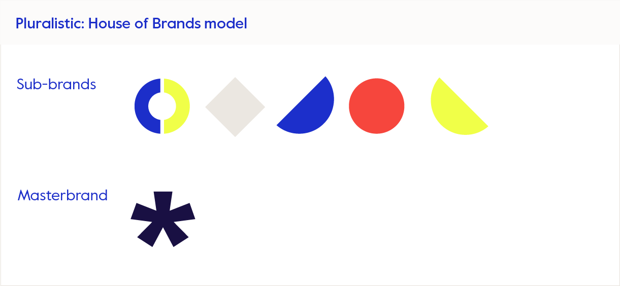
Pluralistic: House of Brands
Defined by a portfolio of distinctive brands, the pluralistic approach means the parent organisation’s identity is hidden or regarded as irrelevant to the end user.
For example, Unilever’s brands operate independently with no visible connection to Unilever on their packaging or in their marketing activity. With brands such as Dove, Ben & Jerry’s and Magnum, the House of Brands approach enables Unilever to tailor its marketing to specific audiences without diluting brand equity. Some of its brands, eg Ben & Jerry’s and Magnum, even occupy the same space.
This one’s a ‘no’
Let’s put this model to bed from the get-go. My focus in this post is on third sector organisations, not the consumer brands that are most often associated with this approach. The example of Unilever, often cited as a successful brand family solution is, in practice, in this sector, vanishingly rare. Even non-profits and charities with the largest budgets would struggle to justify the management and marketing costs of a House of Brands approach. So, for the purpose of this post, we can safely set aside the pluralist model.
The Branded House and Endorsed brand models are far more common in the third sector:
Monolithic: Branded House architecture
The monolithic approach is centred on a dominant, singular masterbrand which is the primary driver of trust. Audience decisions are driven by loyalty to the master brand with its brand promise and personality exerting greater influence than any specific services or initiatives.
Extensions of the brand often see the parent brand’s name paired with descriptive, generic terms. In consumer-brand-land, the example of FedEx is cited as an example of this with its FedEx Express, FedEx Freight etc sub-brands.

An example of an organisation in our sector that uses the Branded House model is UAL.
Masterbrand: UAL: University of the Arts London
Sub-brands: UAL: Central St Martins, UAL: London College of Fashion, UAL: Chelsea College of Arts and so on.

Although we’re labelling the above approach as monolithic, in practice we soon find that the brand and its sub-brands operate, day-to-day, in a more hybrid way, borrowing elements of an Endorsed Brand marketing strategy to maintain the individuality and legacy of UAL’s constituent colleges.
So, what’s an Endorsed Brand?
Endorsed Brand architecture
The Endorsed Brand model sees sub-brands having a clearly defined market presence while, at the same time, benefiting from the association, endorsement and visibility of the parent. The parent brand is almost always presented and associated with the sub-brands.

Eg International Red Cross and Red Crescent Movement
Masterbrand: International Red Cross and Red Crescent Movement
Endorsed sub-brands: International Committee of the Red Cross (ICRC), International Federation of Red Cross and Red Crescent Societies (IFRC) and national societies like the British Red Cross or American Red Cross.
The red cross, red crescent and red crystal are symbols of protection.
Each organisation serves its own unique role but benefits from the globally recognised Red Cross/Red Crescent identity. It is designed quite literally, to protect the authorised medics who wear them.

Perhaps an easier way to explain the differences between Branded House (monolithic) and Endorsed Brand architecture is to view the two models side by side:
| Endorsed Brand model | Branded House model | |
|---|---|---|
| Relationship | Sub-brands can be distinct but are always presented and associated with the masterbrand. Or represented via a version of the phrase “by”: “part of…”, “powered by…” etc. (Adobe + Photoshop, Illustrator, United Nations + UNICEF, UNHCR) | All offerings fall under one unified brand identity. In its wordmark, the masterbrand is always integral to the sub-brand. (UAL + its colleges, WWF + its National offices UK, USA, Australia) |
| Independence | Sub-brands maintain more independence in positioning, look and messaging. | All sub-brands share the same primary positioning and identity. |
| Masterbrand’s role | Acts as a guarantor of quality or trust but allows sub-brands to shine individually. | Dominates all communications and is the primary driver of trust. |
| Sub-brand Identity | Sub-brands may have unique names, logos and target audiences but are likely to share a family resemblance. | Sub-brands are strongly tied to the master brand and rarely, if ever, have independent identities. |
| Brand equity sharing | Equity flows both ways: the masterbrand supports sub-brands and sub-brands give back to the masterbrand. | Equity is consolidated within the masterbrand, benefiting all offerings and sub-brands. |
| Risk/Benefit balance | The failures or successes of sub-brands have limited impact on the masterbrand. | The failures or successes of individual offerings directly affect the entire brand family. |
Mash up and blend – the hybrid solution
It’s worth saying that the world of brands is complex and no one single model can ever be applied uniformly across all activities and regions. It’s not uncommon for Unilever, for example, to incorporate elements of an Endorsed Brand approach when they’re looking to boost credibility or roll out global recognition.
In our sector, The Salvation Army is an example which, although more Branded House as far as its public-facing identity is concerned, adopts an Endorsed Brand approach in its operational structure. This duality stems from:
- Its need to be recognisable and trusted as a singular brand.
- The operational flexibility that is required of it in meeting local needs effectively.

The principles
Whichever route you choose, Branded House or Endorsed Brand, the following are some key principles that you should explore:
- Start with audience-first – Brands serve as tools to help your audience navigate choice and understand relationships. Every decision you make should be through the audience’s lens and designed to make their lives easier. Never make brand architecture decisions on the basis of meeting purely organisational needs.
- Align on mission and values – Whatever model you adopt, your people’s day-to-day work will always cut across and encompass a variety of functions, themes and initiatives.
For example: the Red Cross/Red Crescent Movement operates under a shared mission that unites its various component organisations under a cohesive global purpose while allowing each entity a degree of autonomy to address specific regional needs or goals. - Make your brand family work for you – Maybe your masterbrand is getting lost in the noise of the competing pluralist House of Brands. The strategy should then become one which brings the sub-brands together to help build the authority of the masterbrand. Or perhaps your brand family feels constrained and you’re starting to recognise the benefit of moving towards an Endorsed Brand framework. This aspiration indicates that you need a strategy to build trust, recognition and equity in the masterbrand with some guardrails around how far the sub-brands can exercise independence.
- Labels matter – When renaming or simply combining with the masterbrand, follow the rules – Marty Neumeier sets them out so well here. Think of all the use cases you might have for the masterbrand and the sub-brand names. For example, when written in prose you can’t just rely on the logo to do the talking, write rules and provide guidance on how to use masterbrand + sub-brand, masterbrand + sub-brands, masterbrand + sub-brand + partner brand in prose.
- Be ruthless – Brands take time, energy and budgets to manage. Be hard-nosed when it comes to rationalising how many sub-brands you have. Are they in fact departments? Could several be grouped under one theme? In contrast…
- Protect and respect difference – An organisation with sub-brands that speak to very different personas might need a differentiated tone of voice in each case. A brand that arises out of a merger may have a founding story and heritage that will always carry value and resonance, and this too should be recognised.
- Allow room for expression – As with any brand, singular or suite, it’s wise to build in room to flex. Even UAL’s Branded House approach demonstrates elasticity. Pentagram designed a visual identity that can ‘withstand’ the creative expression of various agencies. The colon ‘:’ acts as a holding device for creative expression, see Johnson Banks’ example below (left) and similarly, in Alphabetical’s vibrant campaign (right):

This offers proof that Pentagram’s identity is a unifier not a straitjacket – brand architecture that offers enough room for interior designers to flourish! - Empower your team – As well as providing clear guidance for everyone in the organisation, also take time to educate and engage senior leadership on the rationale and importance of the chosen brand architecture. Leading by example trickles down. If a member of the SLT goes rogue and breaks all the rules in an internal PowerPoint presentation, that sends out a message to the wider organisation that the rules can be broken.
- Leave egos at the door – Closely linked to point 1. Some people don’t like change; they can’t always see the benefit of revising the model they are so aligned with. Listen to their concerns and invite independent advice. Show them how alignment will help them deliver on, not hinder, their goals.

To wrap up
Brand strategies need revisiting regularly. As equity grows in the masterbrand or indeed in its sub-brand/s, the model you currently employ may need reconsidering. In the past I would have defined Adobe as following an Endorsed Brand model but over time the Adobe name has grown in importance within the overall brand strategy. It’s likely that Adobe’s branding strategy has evolved over time from an Endorsed Brand model to a more monolithic Branded House model as its masterbrand has gained strength and recognition. This kind of strategic shift often happens when a company realises that consolidating its branding can create stronger brand equity and build on customer loyalty.
If your brand family feels like a soupy mess or a bland straitjacket, take time to review and rationalise.
As with most brand strategy projects, start with zooming out, using a wide-angled lens and looking at how your strategic plan aligns with your audience and your marketplace. Make radical change or evolve gradually – there is no one-size-fits-all approach. Do what’s right for your organisation at the time while keeping a keen eye on the future.
Protect and de-risk your brand

Constant, unpredictable change has become the background against which we live our lives and run our businesses and organisations. And with light-fingered AI adding to the uncertainty, helping itself to our creative and commercial endeavours – protecting what’s ours has never been more important.
So, if you’re thinking about rebranding or changing your brand name or, if you’re concerned about preserving what you already have – the authority, reputation and value associated with your existing brand – you may want to consider formally registering your trade mark. Doing things by the book, you will have registered your organisation’s name with Companies House or the Charity Commission, but registering your brand itself offers so much more than just protection.
Brand names are the most universally recognisable communication tool in the world.
Naomi Klein, No Logo: Taking Aim at the Brand Bullies
In this post I focus on the process I recently went through to register The Co-Foundry brand name and some of the benefits that can be gained from doing so. (There are, of course, other types of trade marks – they can include words, logos, shapes (think the Coke bottle shape), colours and even sounds, the Intel audio jingle for example.)
The value of a brand name
A brand name is one of your most valuable assets, with rebranding and/or renaming your organisation being one of the biggest marketing investments you undertake. The processes are both time- and resource-intensive – not just during the initial project but also in the effort it takes to build brand recognition consistently and over time, post-launch. With this in mind, is it worth skipping a step that can protect that investment?
When I rebranded as The Co-Foundry I took that risk. Buoyed up by the excitement of it all, I wanted to get going fast and launch my new consultancy. Being a company of one meant that this course of action (or inaction) posed a far lower risk than it would have done for a medium-sized or large charity or SME. But now, three years on, I have taken the time to protect the name – partly because it’s the right thing to do and also because it allows me, in having a taste of my own medicine, to gain an in-depth understanding of the process.
It’s all in the name
So that I can set out the most complete version of the registration process, I’ve chosen to take you through the steps involved in registering a newly named or renamed organisation.
Renaming is fun. It’s like going out and buying yourself a whole new wardrobe. You can’t wait for the right occasion to show it off. The clothes fit better than the last lot, maybe you’d ‘expanded’ or realised that particular shade of green is a bit off but I digress…Your reasons for renaming can be many and varied.
Renaming isn’t something that should ever be done lightly. As a brand design consultant I only ever recommend a name change when I have solid evidence to support it. This year we’ve worked on renaming two organisations: a digital agency (client interviews revealed that people couldn’t pronounce the quirkily spelt name and found it hard to type and remember) and a young person’s mental health charity (parents in particular found the brand’s initials hard to recall and no one in the organisation could explain what the letters stood for. Parents even went so far as to say that not knowing what the initials meant, made them feel stupid and excluded in a sector that is, after all, awash with acronyms and abbreviations).
Don’t fall in love just yet
When you’re thinking of names, don’t settle on coming up with just one name to put forward. Keep your options open. We always advise running stakeholder testing for your ‘long’ shortlist before settling on a ‘short’ shortlist. We do basic domain name and Companies House checks but these are never as thorough or watertight as those undertaken by an IP lawyer and, speaking from personal experience, it definitely pays to have one in your corner! There’s always the chance that quite early into the process you’ll discover that the name you want is not up for grabs, so we recommend taking three names into step 1 below.
How to register your brand name
Broadly speaking there are four steps you need to complete to achieve a trade mark registration:
- A ‘knockout’ search for a shortlist of say, three names (if renaming) or your existing name – these high-level searches of the trade mark register are done to see whether there are any immediate red flags. This manages the risk of conflict and takes just a few days.
- A full UK clearance search for the preferred name – this is a wider search, and covers not just identical and near-identical, but similar trade marks as well. There’s obviously no guarantee, but following this search you can (assuming the results of the search are relatively clear) be feeling comfortable that the brand name is available from a legal perspective. This step takes around a week from start to finish.
- Filing a trade mark application – typically the first step is filing a UK trade mark application. The Intellectual Property Office (IPO) then examines the eligibility of the trade mark. If there are objections, your IP lawyer responds to them. Before registration is granted, applications are published on the IPO website. With no major objections or oppositions, this Opposition Period can take up to 3 months. If there are other territories that are of interest to you, you could then look at applying for an International Registration, designating these territories, and ‘claiming priority’ from the UK application (provided you file within 6 months of filing the UK application) such that your overseas filings enjoy the initial filing date in the UK.
- Recording the name – assuming the application is successful you are then free to record the new name with the Charity Commission and/or Companies House. And use the ® at the end of your name and logo should you wish to.
With The Co-Foundry it wasn’t necessary to check multiple names, and we’d already registered our name with Companies House so we skipped steps one and four.
Why register your brand name
De-risks your brand
Taking you back to that ‘new wardrobe’ analogy, unwittingly picking a name that a competitor is using, is a whole lot worse than going to a wedding and meeting someone in the same outfit. At best, you risk being politely asked to cease using the name.
Some years ago, Pfizer, a major pharmaceutical company, was ordered to pay $143 million in damages to Trovan Ltd. for using the trade mark TROVAN, as the name of an antibiotic. Pfizer admitted that it was unaware the mark had been previously used and registered, as it had not performed a trade mark clearance search before adopting the name for their product.
Builds value in your brand
As a charity or as a business owner you may be looking to do due diligence on your existing brand name or you may, in the case of a business, be looking to sell at some point in the future (a buyer would almost certainly expect to see trade mark registrations). A formally registered name helps to signal to both clients and potential investors that you’re a serious operator. Other benefits, linked to (steps 1 & 2) clearance searches and (step 3) registrations are as follows:
Benefits of running Clearance Searches
- The main benefit is being sure that you can use your brand without the risk of being sued for trade mark infringement. A relatively modest outlay in the early stages can help avoid potentially significant re-branding costs.
- It makes you confident in the knowledge that if you were to file a trade mark application you’d have an unopposed, clear path to registration.
- Potential investors in your company (or a purchaser if you’re looking to make an exit) will likely need to see evidence of thorough clearance searches, offering reassurance the brand name is available to use.
Benefits of owning trade mark registrations
- It allows you to take action against ‘copycats’ who may be trying to use an identical or similar trade mark, for identical or similar services.
- It helps to signal to potential investors that you are a serious operator when pitching for new business or investment. Also, it allows you to use the ® symbol in your marketing materials, albeit this isn’t obligatory. Looking further forward, if you ever want to make an exit, a buyer would almost certainly expect to see trade mark registrations.
- Trade mark protection is one way in which a business can attempt to put a price on its brand, an otherwise intangible asset. Like any other asset, it can also be exploited to increase turnover for your business (e.g. through selling trade mark registrations that are no longer of commercial interest, collecting royalties from licensed trade marks, or using a trade mark as security for a loan).
- It offers market clarity, providing an understanding of the competitive landscape and avoiding unintentional association with existing brands, which might have a negative impact on yours.
- A registered trade mark can provide a competitive advantage in the market by solidifying brand presence and reducing the risk of brand dilution.
- It builds trust – the ® symbol is a sign that the organisation takes its brand seriously and can be trusted.
Trade marking – a proactive strategy
Conducting thorough trade mark clearance searches is a proactive step in the branding process. It can prevent many potential issues and ensure the longevity and success of a brand. Owning trade mark registrations is a strategic move that provides significant legal, commercial and financial benefits, helping to safeguard and enhance the value of a brand.
This month I received the news that The Co-Foundry® is official! I have the lovely Jonty Warner to thank for holding my hand through the process.

There is nothing quite like eating your own dog food.
Endnote
As you might imagine, I’m a passionate advocate for using specialist professional consultants. Rather than going with a large agency or, in this case, law firm, I chose to work with an independent lawyer Jonty Warner. Jonty has provided the process and legal advice for this article. Every case of trade marking will be different and times change so always seek advice directly from a professional. This article is intended as an introduction, recounting a personal experience and does not constitute legal advice.
