
Publishing brands

Cast your eye across the bookshelves in Waterstones and, away from the fiction, you’ll find yourself surrounded with books by brands. Some of those publications will be overtly brand-led (chef, restaurant and food brands in particular), others will take you quietly into their confidence – drawing you in with their stories, making you feel part of something substantial, promising and important.
It’s obvious why book publishers want to have brands on their covers – in an increasingly digital world, names and logos we know and trust keep hard copies moving off the shelves. But, what’s in it for the brands? Why bother with the time-consuming process of making books or magazines, drawing resources away from the primary focus of the business?
There’s nothing new about content marketing – brands have been doing it for centuries (yes, really). Think Michelin Guide: the tyre company published its first drivers’ travel companion (we know it as the Red Guide now) in 1900 when there were only 3,000 cars on the road in France. Michelin believed the guide would encourage more people to travel by car, putting more cars on the road and so increasing the demand for tyres. There was no direct advertising, no overt message to tell you to “Buy Michelin Tyres”. Instead, the Michelin guide established the company as a lifestyle enhancer, an information provider, an expert – the kind of company you’d want to buy your tyres from, and people did. Now, of course, Michelin is also the much-coveted quality mark for the finest restaurants in the world. A brand invented and then re-invented—and that reinvention started with a book.
Today, brands have greater power than ever to become trendsetters, to lead the field in what’s hot and what’s not. The Red Bull print magazine has around 2 million subscribers and is published in 11 countries. Its pages aren’t filled with information about the energy drink, but with articles about high-octane, high-energy sports and lifestyle. Red Bull is giving its market what it wants – aspirational living, adventure on the newsstand, thoughtful, intelligent insight into the world its consumers dream of carving for themselves. In turn, Red Bull has become the perceived expert on extreme sports – when I take to the skies in an inflatable wingsuit, I’m drinking Red Bull first… every time.

From Ella’s Kitchen to Nespresso and Red Bull to Michelin, brands have increasingly tapped into the marketing potential for intelligent storytelling in hard-copy format. Brand identity and authenticity reveal themselves through design, typography, photography and written ‘voice’ to build a deep sense of trust, belief and loyalty in consumers (statistics show that branded content increases loyalty by up to 30 percent). Add to that the opportunities to create something that sets a brand apart from its competitors in a business-to-business environment and the ripple effect for sales goes on. Yes, books and magazines may take longer to make, but they live longer, too – no swiping away, deleting or unsubscribing.
In the end the success of brand publishing comes down to human instinct: we trust something physical that appeals to our senses and emotions. Something we can actually feel draws us into its confidence. And when what we’re holding makes us feel good, positive, reassured, hopeful, inspired… we want more of it as often and in as many ways as possible.
Finding the American way

We recently completed a rebrand of the American Museum & Gardens following the addition of the £2m New American Garden. A major part of the project was designing the wayfinding scheme around the museum grounds. Here’s what we learnt during the process…
1. Work closely with the primary decision maker
Our creative director Sue worked closely with the museum director Dr Richard Wendorf. He was generous in giving his time throughout the project, starting with a walk around the site to discuss visitor flow and his vision for the museum and gardens.
A client’s clearly expressed vision will always bring out the best in the creative team.
2. Plan quickly and methodically
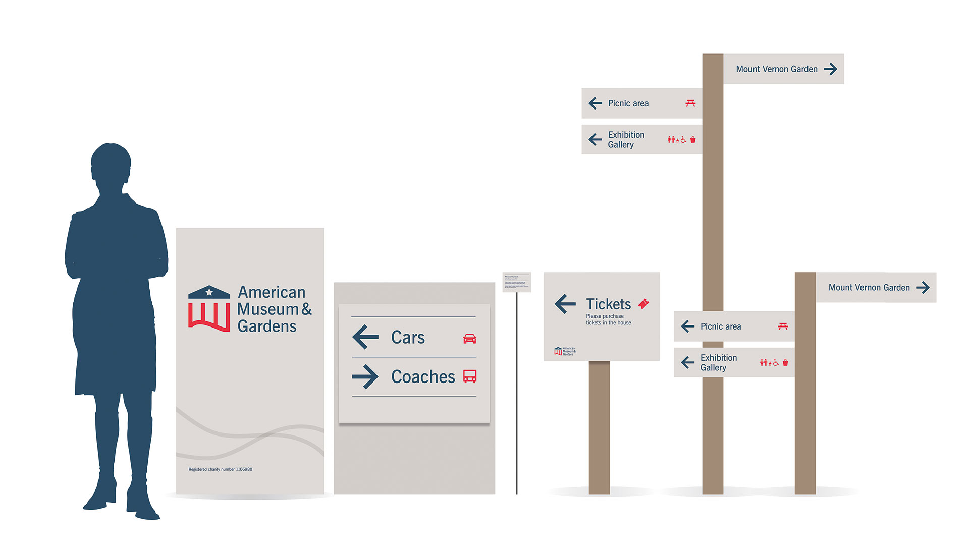
Immediately after the site visit the team at Touchpoint Design plotted each of the proposed 35 sign locations on to a map and categorised each sign by type: direction, orientation, identification, regulation and interpretation.
This document was used throughout the process, from briefing suppliers through to producing artwork and finally acting as guidance for the installation team.
3. Design in the round
To help the museum’s project team visualise the proposed signage and provide them with a sense of scale, and in order to move the designs forward a pace our project designer Georgia produced a design schematic, showing each sign type in one overview diagram.
A schematic is a quick and simple method to communicate with the client, before going too far with the time-consuming artworking of each individual piece.
4. Stay true to the brand
Insights gained on the initial site walk informed the brand identity, making it easy for the team to produce a seamless visual language. During the walk, the museum director showed Sue a sample of the paint colour that would be used on the new ticket pavilions at the entrance to the garden. This became our secondary colour palette for the brand identity and the signage.
To ensure a consistent brand experience, it is important that the wayfinding is designed as part of the overall brand identity, rather than as a stand-alone design exercise.
5. Respect and reflect the environment
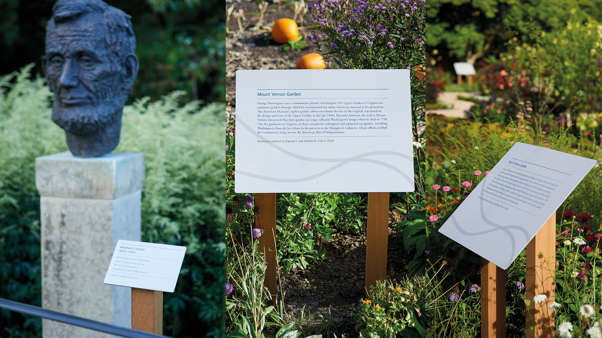
Work with the garden design and the surrounding landscape to avoid breaking sight lines by introducing signs that are too high, too big, or too obtrusive.
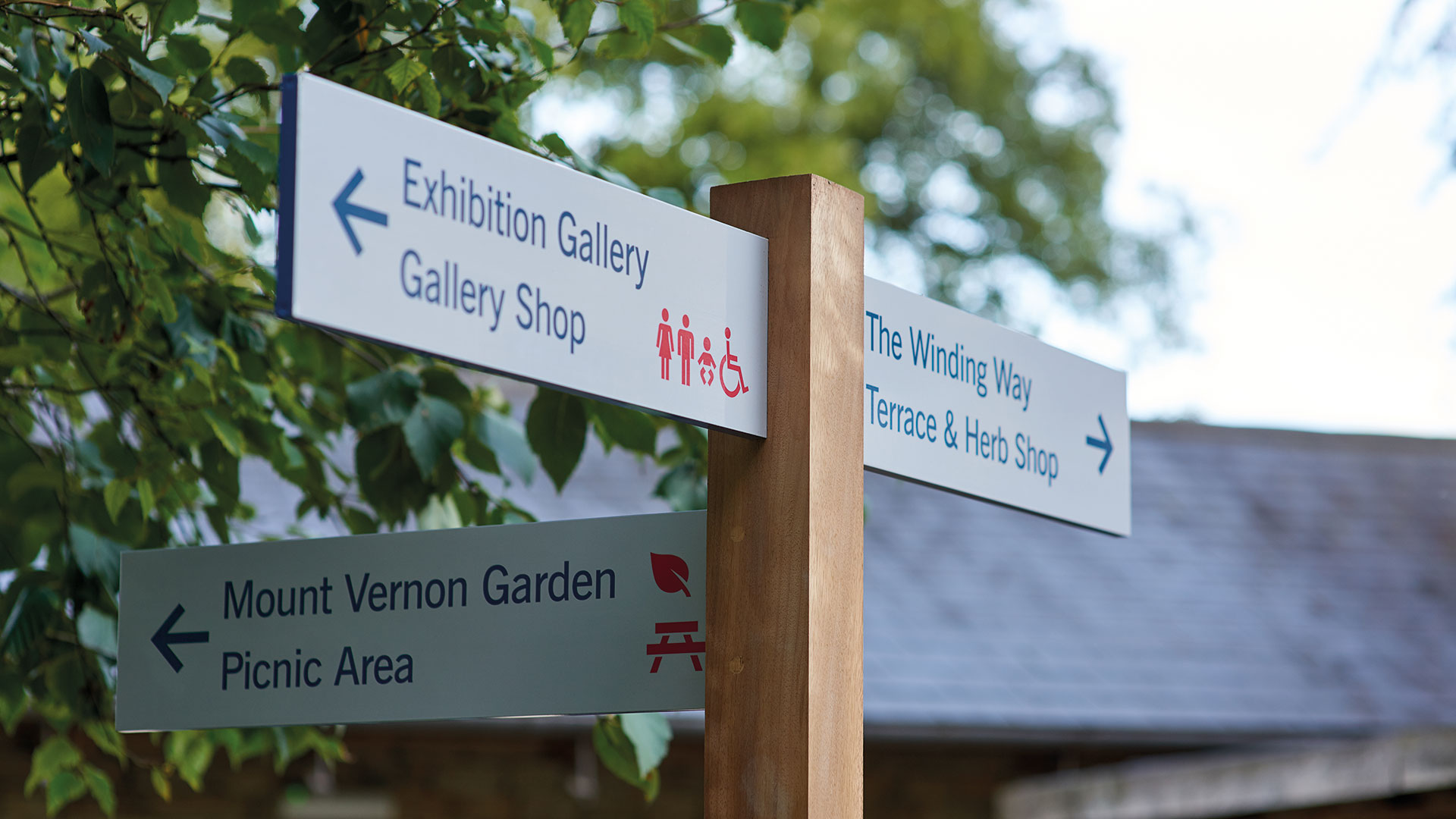
The choice of materials and finish also help to place the signage sensitively within the environment. We chose the West African hardwood Iroko for the posts, which complemented the natural environment.
We worked with the team at Freestyle Design to produce a stylish finish with minimal visible fixings, which was important as Claverton Manor, which houses the museum, is Grade I listed.
Working closely with your supplier and tap in to their knowledge of fabrication techniques to achieve a finish that fits the brief.
6. Consider accessibility
To ensure a perfect experience for children and wheelchair users, we followed established guidelines for optimum viewing heights for signage, while effective use of colour, contrast and scale helped to enhance the clarity and impact of the signs, and used icons for foreign visitors.
Museums are for all to enjoy, so keep the diversity of your visitors in mind at all times.

7. Think about the micro as well as the macro interaction points
Wayfinding isn’t just about physical signage, printed literature can support the visitor’s journey around the site. We commissioned graphic artist Fi Powers to illustrate an isometric visitor map of the site. We also designed hand held planting plans for the horticulture-lovers to identify the shrubs and perennials in the gardens.

8. Watch and listen
No matter how carefully considered the signage, after the garden has been open for a while, we may have to revisit our assumptions about how visitors navigate the site. The client and the design team have committed to keep an open mind, and we will watch how people use the gardens and respond to their comments and feedback given to staff and volunteers.
We found that if you apply the principles of digital user experience to wayfinding, you can’t go far wrong
Whether designing an app, a website, or a successful wayfinding scheme, the principles are the same: consider user needs, plot user journeys, define clear nomenclature, design for the widest audience and stay true to the brand.
5 Tips for a more successful call to action
In the site planning stage you will have defined with your design agency all primary call to actions across the site (data capture forms, links to product pages etc). The next step for the agency is to design the Call To Action (CTA) so that people feel moved to take action. The CTA must work quickly to draw attention – through visual clues and positioning, and through convincing words.
This infographic outlines 5 tips to creating a successful call to action:

Infographic by Lisa Margetis
Example of an effective CTA
In this website design you will see that we placed the primary call to action in a contrasting colour in the top left corner of the page [1]. We also repeat it further down the page [2]. The form itself sits at the base of every page, the action of clicking the button auto scrolls the page down to the form [3]. The analytics show a very healthy conversion rate: 1 in 5 visitors request a quote after visiting the site.

*The average attention span in 2015 is 8.25 seconds
How can a rebrand help your business? 5 reasons why…
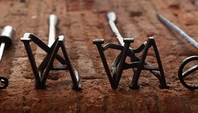
Before we consider the ‘whys’, let’s take a step back and look at the definition of a brand. A brand is so much more than just a name, logo or motif. Put simply, your brand is what your clients and prospects think of when they hear your brand name – both visual, and emotional.
A rebranding exercise involves taking an in-depth look at: your products/services, your marketplace, your unique selling point, your competitors, your brand attributes and the emotional benefit customers experience through your brand.
How can a rebrand help your business?
A good brand can help a business reach more of the right customers, charge higher prices and ensure a more consistent flow of business. A good brand can also attract the right staff and partners, give a business more credibility and help demonstrate leadership. This all sounds great right but how is this achieved? The key is to work with an agency that has a good track record in developing brands.
When is it the right time to re-invest in your brand?
In the early years budgets can be tight. When businesses grow they have the opportunity to reinvest their profit in reviewing the strength and impact of their brand, and boost their position in the marketplace.
Businesses commonly invest in a rebrand when:
- They realise that their original branding now looks dated and/or poorly designed and they want to project a more professional image.
- They’ve diversified and expanded and their business name no longer reflects the products or services they offer.
- They have merged with another company and it’s of benefit to reflect this partnership in their brand identity.
- The business has suffered some brand damage or their name/identity is similar to another of ill repute and they wish to relaunch or reposition their business.
- There is some confusion about what their business actually does on first glance.
Examples of rebranding successes and failures
Encapsulating a company’s goals, message, and culture into one brand is no mean feat. To truly achieve an outstanding brand that reflects every aspect of a business takes the skills of an experienced brand specialist.
Let’s look at logo redesigns. Your logo is not your brand, nor is it your identity. Logo design, brand identity design and branding all have different roles to play but collectively, they form a perceived image of a business, product or service. If you are interested in this definition then read more on it here.
Here are some examples of companies who have revived their fortunes by reinvesting in their brand:

Rather than one sudden rebrand Google has evolved over its lifetime. The latest iteration of the logo is designed to be legible on the tiniest of digital devices, whilst at the same time maintaining established brand attributes with a simple, uncluttered, colourful and friendly logo.

Brunel Shipping
Sometimes it’s more beneficial for a business to refine its brand rather than starting from scratch. Brunel Shipping have nearly 30 years in business. Completely reinventing their logo would risk losing recognition and consistency. At Touchpoint, we took the approach that the logo needed to be brought up to do date, redrawn to reflect their professional approach to business and to improve legibility when used across print and digital media.

Science Council
The original logo for the Science Council was developed before the organisation had matured. Now out of their infancy, we advised them to create a new logo which represented their brand attributes – Inclusive, Balanced, Positive, and Collaborative. The typography and colour of the original brand identity looked more to the past than the future so we selected a modern typeface and a bright and bold colour palette which was fresh, modern and accessible. Read more about this rebrand here.
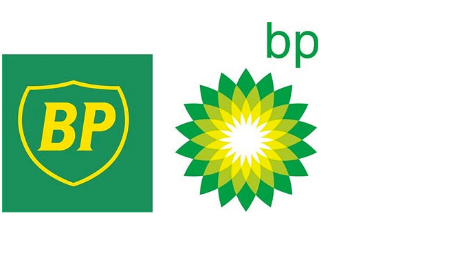
BP
Not all rebrands are a success. BP replaced a strong logo that had been with their company for around 70 years and replaced it with their current logo design. They sought to project a soft more environmental image, however, a change of this nature must be authentic and compelling. Environmentalists were not convinced and the change generated a lot of bad press. Ten years after the launch of the new logo, BP were responsible for what is considered the largest marine oil spill in the history of the petroleum industry – proving that you must live by your brand messages or suffer the consequences.
There is no need to fix what isn’t broken, you risk losing customers and followers. Rebrand for the right reasons and not just to stir things up.
Once you’ve been through the rigorous process of branding and you’re happy with your key brand messages and visual identity, don’t forget to do two things.
- Live and breathe your brand within the business, and externally.
- Be consistent and constant in the execution of your brand messages.
