Finding the American way
Eight things we learned when managing this wayfinding project

We recently completed a rebrand of the American Museum & Gardens following the addition of the £2m New American Garden. A major part of the project was designing the wayfinding scheme around the museum grounds. Here’s what we learnt during the process…
1. Work closely with the primary decision maker
Our creative director Sue worked closely with the museum director Dr Richard Wendorf. He was generous in giving his time throughout the project, starting with a walk around the site to discuss visitor flow and his vision for the museum and gardens.
A client’s clearly expressed vision will always bring out the best in the creative team.
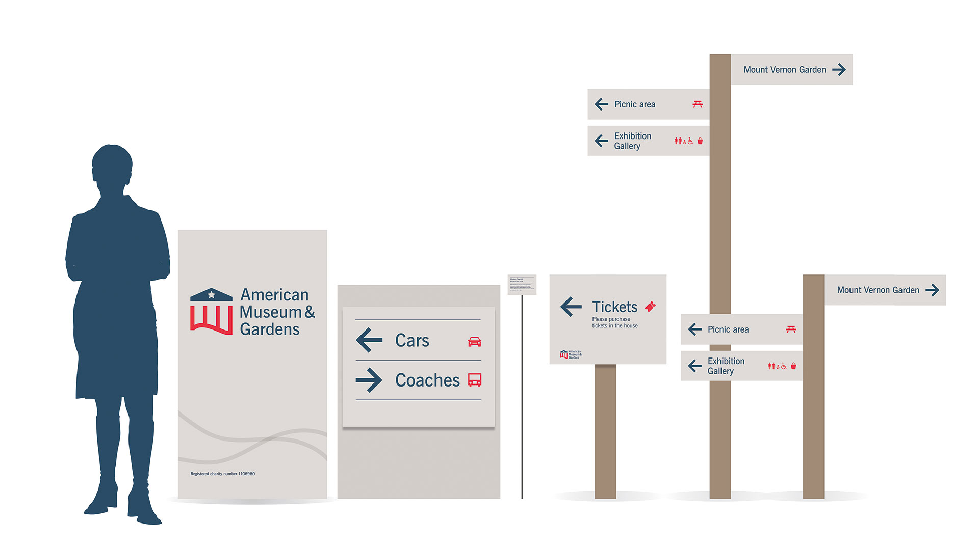
2. Plan quickly and methodically
Immediately after the site visit the team at Touchpoint Design plotted each of the proposed 35 sign locations on to a map and categorised each sign by type: direction, orientation, identification, regulation and interpretation.
This document was used throughout the process, from briefing suppliers through to producing artwork and finally acting as guidance for the installation team.
3. Design in the round
To help the museum’s project team visualise the proposed signage and provide them with a sense of scale, and in order to move the designs forward a pace our project designer Georgia produced a design schematic, showing each sign type in one overview diagram.
A schematic is a quick and simple method to communicate with the client, before going too far with the time-consuming artworking of each individual piece.
4. Stay true to the brand
Insights gained on the initial site walk informed the brand identity, making it easy for the team to produce a seamless visual language. During the walk, the museum director showed Sue a sample of the paint colour that would be used on the new ticket pavilions at the entrance to the garden. This became our secondary colour palette for the brand identity and the signage.
To ensure a consistent brand experience, it is important that the wayfinding is designed as part of the overall brand identity, rather than as a stand-alone design exercise.
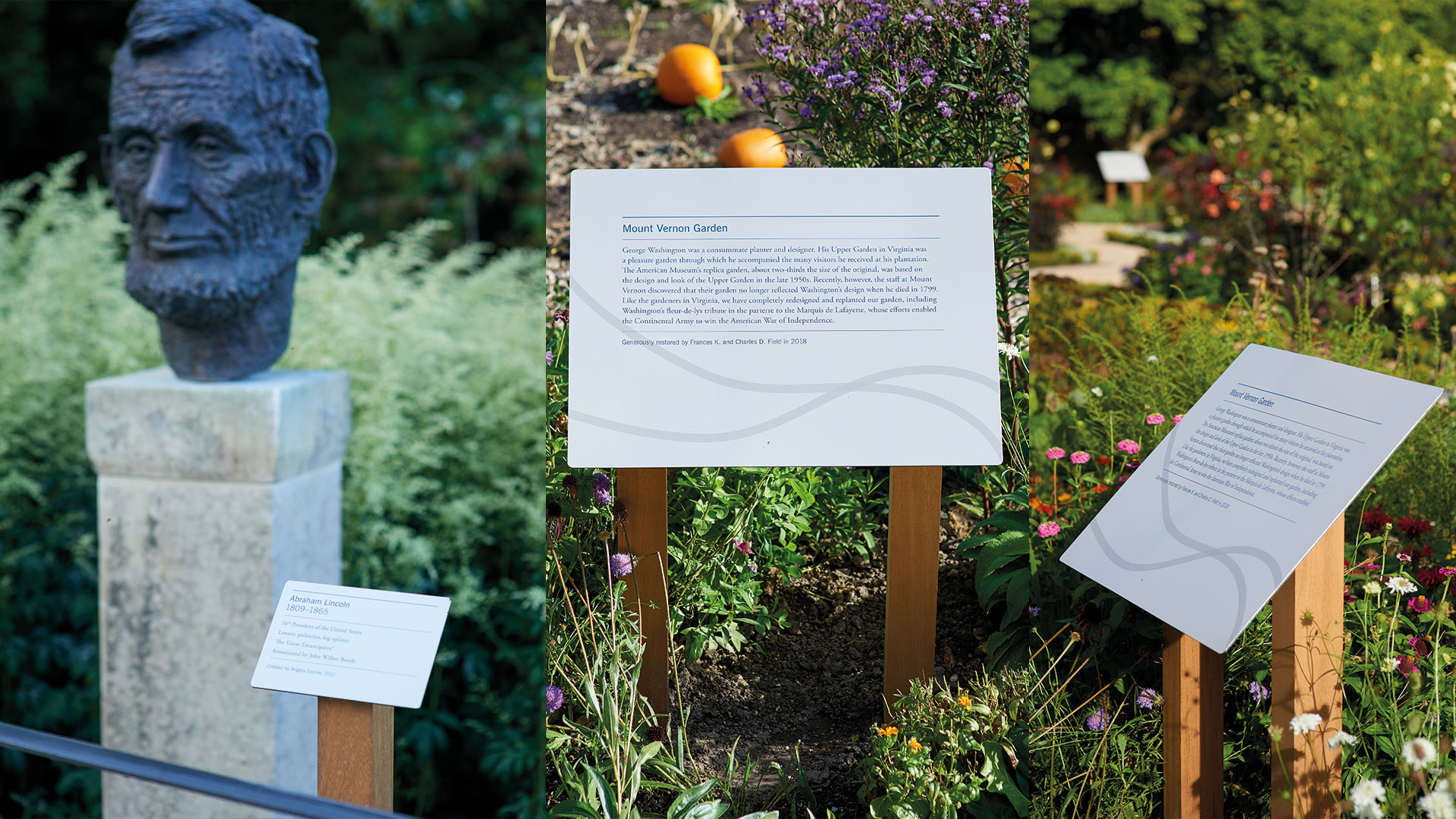
5. Respect and reflect the environment
Work with the garden design and the surrounding landscape to avoid breaking sight lines by introducing signs that are too high, too big, or too obtrusive.
The choice of materials and finish also help to place the signage sensitively within the environment. We chose the West African hardwood Iroko for the posts, which complemented the natural environment.
We worked with the team at Freestyle Design to produce a stylish finish with minimal visible fixings, which was important as Claverton Manor, which houses the museum, is Grade I listed.
Working closely with your supplier and tap in to their knowledge of fabrication techniques to achieve a finish that fits the brief.
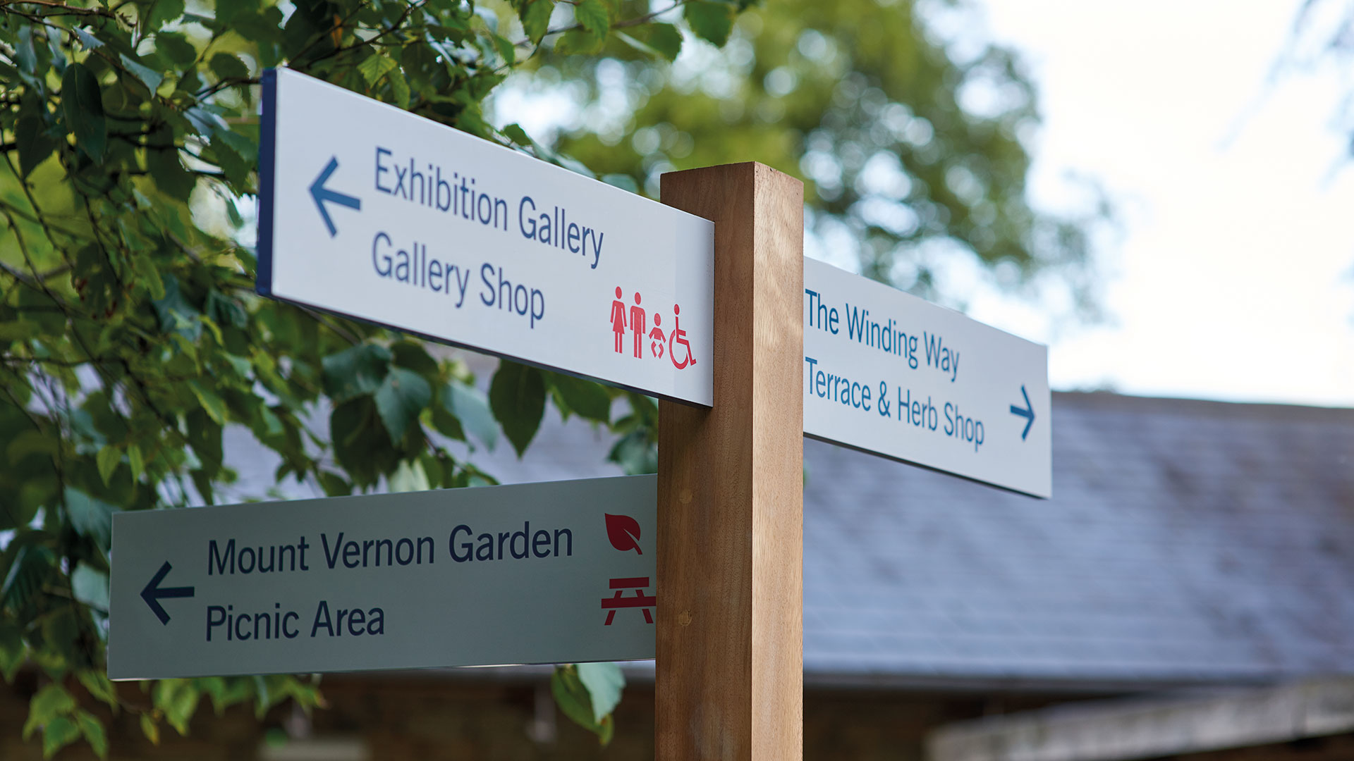
6. Consider accessibility
To ensure a perfect experience for children and wheelchair users, we followed established guidelines for optimum viewing heights for signage, while effective use of colour, contrast and scale helped to enhance the clarity and impact of the signs, and used icons for foreign visitors.
Museums are for all to enjoy, so keep the diversity of your visitors in mind at all times.

7. Think about the micro as well as the macro interaction points
Wayfinding isn’t just about physical signage, printed literature can support the visitor’s journey around the site. We commissioned graphic artist Fi Powers to illustrate an isometric visitor map of the site. We also designed hand held planting plans for the horticulture-lovers to identify the shrubs and perennials in the gardens.

8. Watch and listen
No matter how carefully considered the signage, after the garden has been open for a while, we may have to revisit our assumptions about how visitors navigate the site. The client and the design team have committed to keep an open mind, and we will watch how people use the gardens and respond to their comments and feedback given to staff and volunteers.
We found that if you apply the principles of digital user experience to wayfinding, you can’t go far wrong
Whether designing an app, a website, or a successful wayfinding scheme, the principles are the same: consider user needs, plot user journeys, define clear nomenclature, design for the widest audience and stay true to the brand.