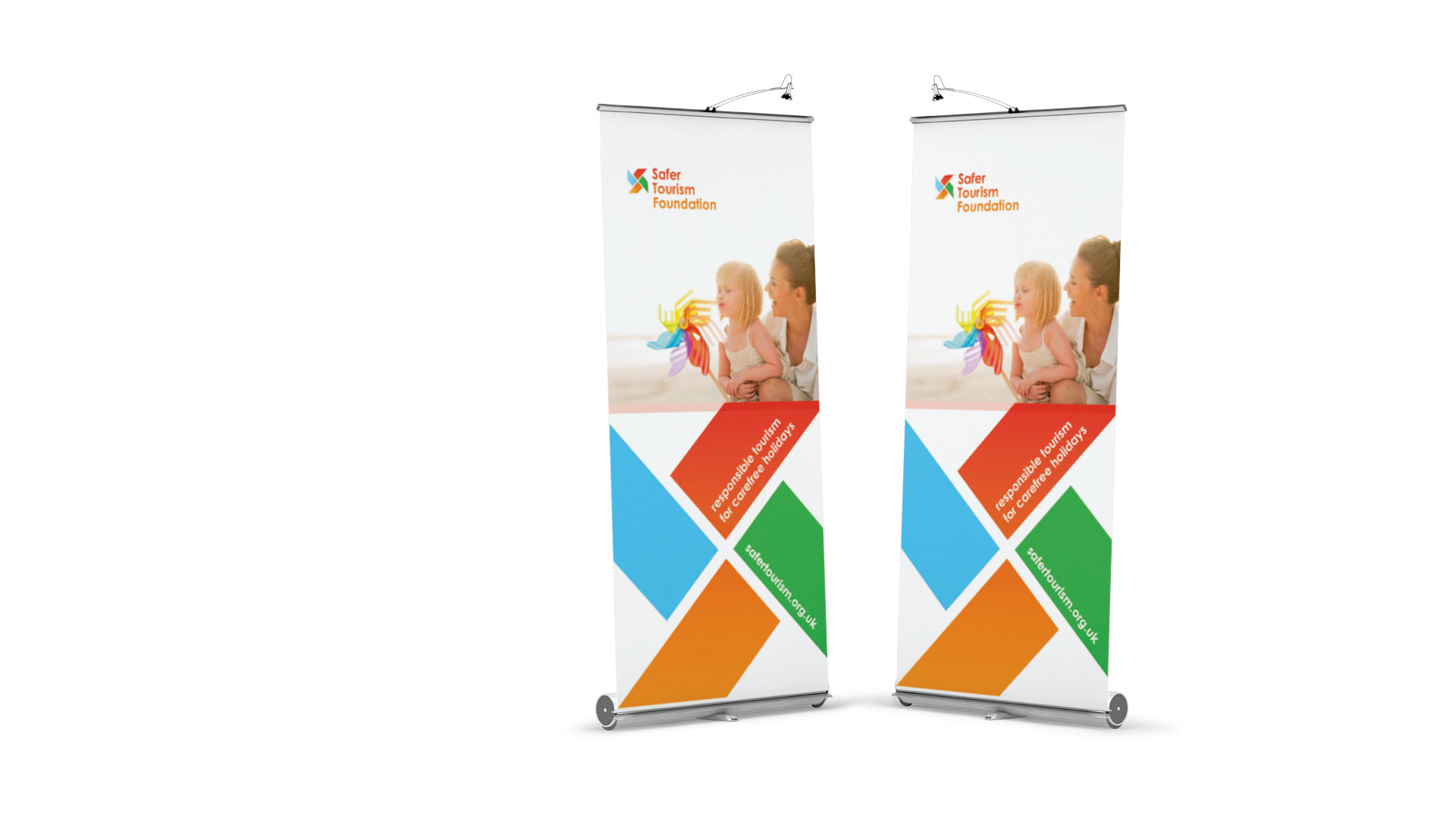
Safer Tourism Foundation
Objective: To design the brand identity for a new charity, formed by Thomas Cook in response to the deaths of two young children from Carbon Monoxide poisoning whilst on holiday in Corfu.
Objective: To design the brand identity for a new charity, formed by Thomas Cook in response to the deaths of two young children from Carbon Monoxide poisoning whilst on holiday in Corfu.
To positively attract travellers’ attention whilst still communicating the seriousness of the Foundation’s educational messages regarding CO poisoning and other risks and health factors associated with travel. To be sensitive to the delicate nature of the subject matter whilst appearing warm, positive and accessible.

We designed a pinwheel motif using the ‘S’ character, this symbolises carefree beach holidays and happy childhood memories whilst also alluding to clean air. We selected a bold spectrum of colours to further evoke happiness and warmth. We took the decision to use positive rather than ‘negative’ photography – deliberately choosing to show the desired vision of a safe and happy holiday over what can go wrong.
Thomas Cook tested our design choices during an intensive day of focus groups, run by professional researchers.
“Warm colours like a sunset…a windmill, think it’s for everyone.”
“Friendly, there to help you…a foundation you go to for information”
“Helpful, approachable, for all kinds of people, there for you
Comments made during the market research sessions in response to the new logomark

We designed the Foundation’s website with the same sense of warmth and positivity, applying the colour palette and using the pinwheel motif as a decorative graphic device to add dynamism.
As the charity grew and matured it became apparent that the Safer Tourism website could also act as a hub, providing broader health and safety guidance for travellers.

As part of our ongoing relationship, we carried out a redesign to ensure the site could provide high-quality, easily accessible, news and information. The home page layout now prioritises the most recent stories and vast library of travel tips and guidelines, while better navigation makes content of interest easier to find. The result is an engaging and inviting design that is informative, simple to use and visually appealing.