Skylark rebrand

Skylark Media’s mission is to help sustainable and ethical brands communicate their purpose through video. Founder Jo Haywood began her career in the early ‘90s – she made a name for herself while working on science documentaries for the BBC and Discovery Channel, such as groundbreaking climate change series Fast Frozen Future.

Jo and her team wanted to position Skylark as a brave, sustainable and innovative company that produces high quality, customer-focused content. With an outdated logo and a brand that failed to reflect their full creative offering, they called on The Co-Foundry for support.

Challenge

As a truly purpose-driven brand, Skylark care deeply about their responsibility in the world. Our challenge was to build consensus in the Skylark team (including its founder and directors), collaborating to develop a brand that everyone in the company can get behind.

When a creative agency comes to redesigning their brand it creates a lot of enthusiasm; what we needed was someone who could work with us to harness this energy. Through co-creation workshops, Sue made sure everyone’s voice was heard and delivered us a brand makeover that makes us proud every time we see it.

—Jo Haywood, Founder, Skylark Media

Solution

Co-creation is often key to developing a truly authentic brand, and with a creative team like Skylark, this project was no exception.

We began by reviewing the company’s positioning, purpose, personality, values and audience. As well as reviewing how other video production companies communicate, we explored approaches from social purpose brands in different sectors to gain a wider perspective on where Skylark’s brand should operate from. The result: a brand identity that truly reflects Skylarks’ character and value proposition.

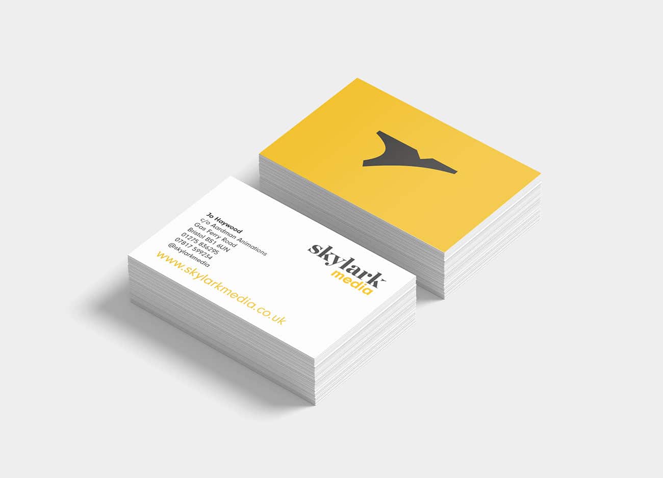
The main idea behind the new brand was to ‘help brands fly higher’: the visual manifestation of this involved subtly tweaking the ‘k’ of Skylark as a nod to the theme of flight. Set in an open, contemporary and warm serif typeface (Chronicle Display by the type foundry Hoefler&Co) and paired with a robust, geometric sans-serif typeface, the wordmark establishes a timeless-but-contemporary identity for the company. A striking colour palette and supporting graphic devices such as tree rings help to reinforce the brand’s sustainable ethos.

Remote co-creation

With this collaboration taking place in the middle of lockdown, we used the opportunity to move our co-creation workshops online, making them as interactive and engaging as possible through a combination of video calls, screen sharing and group exercises. While it’s impossible to remotely replicate the experience of an in-person workshop, we found that the process worked well, and have continued to hone the way we approach virtual collaboration in subsequent rebrand projects.

Skylark Media company website
Back to topUP